Marketing has entered a new phase—and it’s moving fast.
AI is compressing timelines. Customer expectations are rising in real time. And the distance between brands that lead and brands that lag is expanding by the day.
In this environment, “good enough” doesn’t even make the shortlist. Marketers are scanning for advantage—for platforms that can help them move faster, act smarter, and stay ahead. And increasingly, customers make that call based on perception—long before they experience the product. A company’s brand is the first signal, and often the most enduring one.
That’s where Iterable faced a critical challenge.
The Brand Lag Was Real
Over the years, Iterable has accelerated and evolved into a true market leader. The platform has become more powerful and intelligent. The leadership bench has expanded and matured. The team has consistently raised the bar on execution and partnership.
But much of that evolution was happening behind the scenes. The brand was still telling a smaller story, rooted in an earlier chapter we had already outgrown.
I knew that disconnect because I had seen it from the outside first.
From Iterable Customer to CMO
Before joining Iterable as CMO, I was a 2x Iterable customer. First at Box, and later at SurveyMonkey. I experienced the platform and team in the context that actually matters—operating against real business goals, with real pressure to perform.
The experience with Iterable was genuinely high-performing. The brand just didn’t live up to it.
So when I stepped in as CMO in November of last year, the question wasn’t whether we should rebrand, it was how quickly we could bring the brand up to the level of the platform and the team behind it.
Speed, Substance, and Standing Apart
Within my first few weeks in the CMO seat, we got the ball rolling. In an AI-accelerated world, you don’t get a long runway to explore and make decisions—if you explore forever, the moment passes you by.
We pulled together a tight, cross-functional team across product marketing, brand design, content, communications, and product design so every decision—from narrative to visuals to in-product moments—laddered up to one clear brand. Product design was especially key: as a SaaS company, the brand has to live inside the product, in the details customers touch every day, not just on the homepage.
We also partnered with Focus Labs, an external agency that pushed our thinking and helped translate the strategy into a cohesive visual and verbal system.
From day one, we made a deliberate call about how we wanted to show up. In the age of AI—where change is constant, and sameness has become the default—we saw an opportunity and a responsibility to do something different.
What you see today is a brand with a clear point of view, a sense of maturity, and a level of craft that sets it apart today and carries it forward as the market continues to evolve.
What’s New: The Before and After
Iterable Logo
The old Iterable logo and wordmark were expressive and recognizable, but it didn’t scale in real-world applications, lost clarity at smaller sizes, and felt more playful and early-stage than the platform we’ve built.
The new Iterable logo is a monogram built around the “I,” designed to signal movement and forward momentum. It’s not decorative; it’s a cue about what we do: help marketers know where to go next.
And the logotype moves to a simpler, sentence‑case treatment with a technical edge, improving legibility and balance so the name becomes the focal point and the mark supports it instead of overshadowing it.
Together, the logo system now feels clearer, more mature, and aligned with how we intend to show up in the category, and we’re ecstatic about it!
Typography
Typography is one of the fastest signals of credibility. People decide whether a brand feels established and trustworthy in milliseconds, often before they read a single word.
Our previous system was functional but flat. It didn’t create enough hierarchy, headlines lacked weight, and the overall effect skewed more “early-stage tool” than “enterprise platform.”
In this rebrand, we evolved to a serif-led system to signal maturity and credibility. Icona Serif now anchors our headlines with a modern seriousness that matches the clarity and confidence we deliver to teams operating at scale.
We pair Icona Serif with a clean sans serif for product and body copy to keep things clear, flexible, and highly usable.
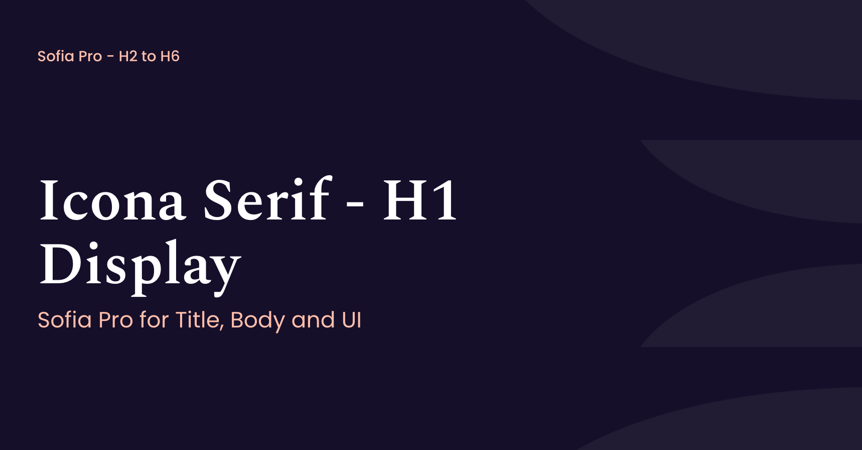
Our Typography no longer sits in the background—it actively signals that what you’re about to read is worth your attention.
Color Palette
Color is where many brands start to blur together. Everyone’s chasing the same bright gradients and neon candy shells—high impact on first glance, forgettable (and dated) soon after.
We opted out of that arms race. A restrained palette of blues and greens gives us a calm, confident center of gravity—mature, stable, and intelligent instead of shouting for attention. Deep darks carry weight and signal scale; light neutrals keep the experience breathable. Greens and teals evoke the intelligence and adaptability embedded deeply in our platform.
Accents still hit hard, but only where they should—pulling focus, signaling action, injecting energy in the right moments instead of everywhere at once.
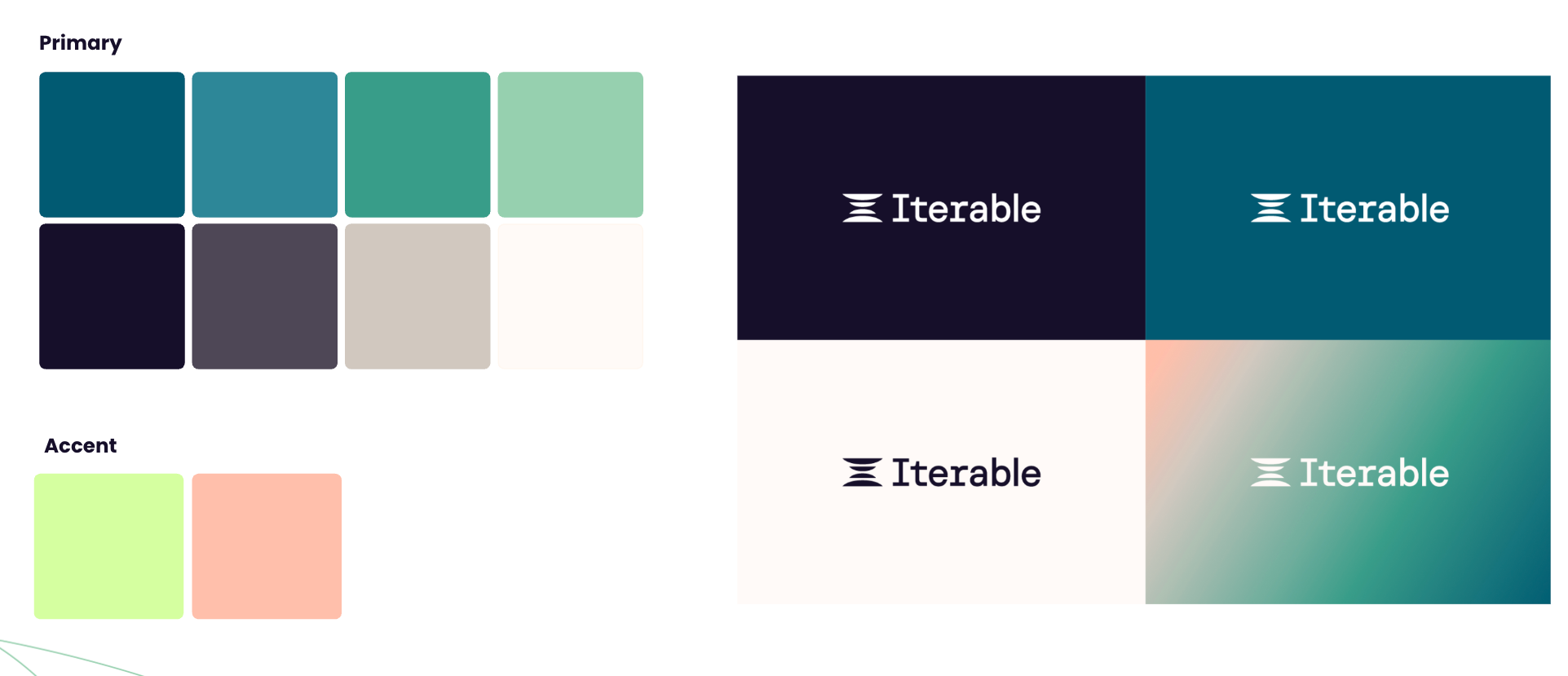
Color and logo now click together as a single, recognizable system: less spectacle, more signal.
Voice and Tone
Most people don’t meet Iterable through a demo—they meet us through a message. Long before they understand the platform, they’ve already decided whether we sound like someone worth listening to.
For a long time, our voice was careful and restrained. Clear, but hedged. It did the job, but it didn’t sound like a company rewriting how brands use data and AI. It sounded like we were standing at the edge of the conversation, not leading it.
The new voice steps into the room. It’s decisive, grounded, instructive, and catalytic. We don’t meander toward an idea—we say what we think. We don’t just list features—we tell people what they can actually go do.
In practical terms, that looks like:
- Making our POV on the future of marketing unmistakable and actionable.
- Framing outcomes for customers, not just capabilities for us.
- Writing with the confidence of a platform that’s proven at scale.
The goal isn’t to add noise. It’s to add value as a real partner: one who knows what’s possible, says it plainly, and gives you the nudge to move.
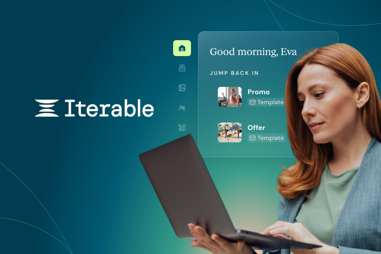
Bringing It All Together in The Product
Iterable has always occupied a unique space: the platform marketers choose, built by engineers who care deeply about how things work.
That’s been a strength from the beginning, and this rebrand was an opportunity to bring those two sides together more intentionally. Not just to look better, but to feel more intuitive and aligned with how marketers actually think and operate.
We worked closely with product design to evolve the UI, reinforcing the brand at every level. We moved from a horizontal top navigation to a collapsible vertical sidebar, the same structure used by the enterprise tools marketers already work in every day. We reworked our color system and typography so the Iterable you see on the website, in our emails, and on stage at Activate is the same Iterable you see when you log in. Every color choice was validated against WCAG accessibility standards. That was a design requirement, not an afterthought.
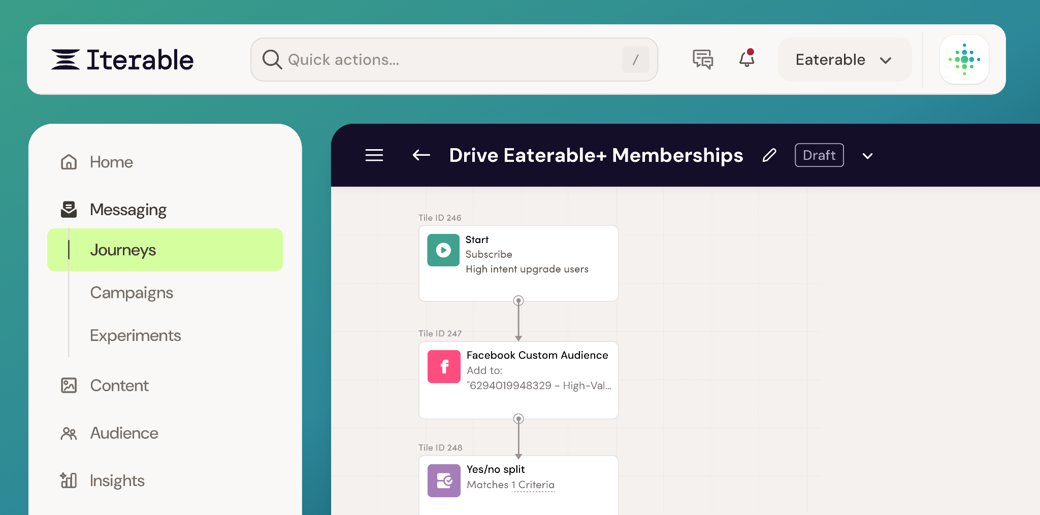
The result is a platform that feels as considered as the campaigns marketers build inside it.
“Activating” the New Iterable Brand
Today, we didn’t just launch a new look and feel. We flipped the switch on a new expression of Iterable—one that matches the ambition of our product and where we’re headed.
The timing is deliberate. It’s coming to life this week, in person, at our keystone event—Activate Summit—where nearly 1,000 marketers and marketing leaders from our community will be together in person in LA.
And it won’t just be something you see—it’s something you’ll feel.
From the product to the main stage, across every screen and moment in between, the new brand will show up as one connected experience. It’s cohesive, intentional, and unmistakably Iterable—no matter where you encounter it.
This is a brand built to show up consistently—everywhere it matters, and everywhere we’re going.
And we’re excited to bring it to life, in real time, at Activate.
Advice for Other Leaders
The most important decisions we made didn’t start with design. They started with how we operate.
Run As One. Be An Owner. Transparency. Growth Mindset.
Those aren’t posters on a wall—they’re the standard we hold ourselves to. And throughout this process, they showed up everywhere. In how quickly we moved. In how directly we made decisions. In how openly we challenged our own thinking.
You can see it in the system we built. A brand that’s cohesive across product and marketing. A voice that states what we believe, clearly. A visual identity that reflects maturity without losing momentum.
This wasn’t about layering values onto a brand. It was about building a brand that operates the same way we do.
Because in a market that’s moving this fast, alignment isn’t optional. It’s what allows you to move with clarity—and keep moving as everything else changes.