The emails presented in this communication are for illustrative purposes only and are not representative of any official endorsements or partnerships with the brands featured. The brands mentioned in this communication are not all Iterable customers or affiliates. The purpose of showcasing these examples is to provide generic representations of effective email marketing strategies, design elements, or content practices. The inclusion of any brand names or logos does not imply any association, endorsement, or relationship with the entities mentioned. If you have any concerns or inquiries regarding the content presented, please contact us for clarification. We respect the intellectual property rights of all brands and aim to use examples that adhere to ethical standards.
With every new year comes new design trends. While we’re over a month into 2024, we figured it’s as good a time as any to focus on some marketing design trends we expect to take off this year. In 2023 we predicted retro, monochrome, highlights, outlines, and touches of illustration. Some of last year’s trends are likely going to stick around for the long haul (retro, we’re lookin’ at you), but this year, things are going to be a bit different.
Who better than us, an in-house Iterable Brand Designer and Social Media Manager, to share our expertise and look at what design trends brands can expect to show up in future marketing communications?
1. Kitsch
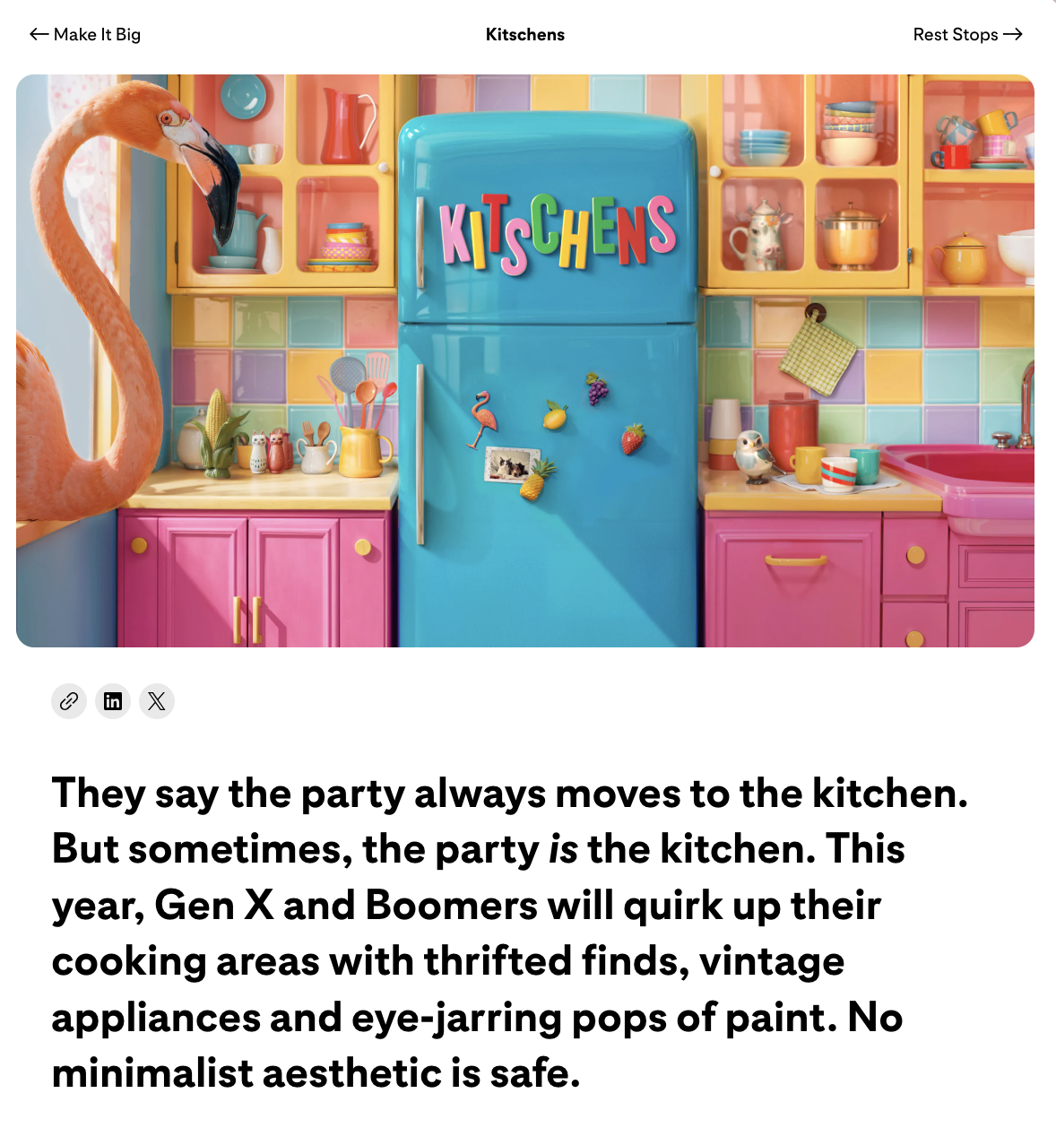
Kitsch has historically been defined as, “Something that appeals to popular or lowbrow taste and is often of poor quality.” First of all, rude. Through the lens of this design trend we’re equating kitsch more to unique, colorful, retro, and tacky (in the best possible way). Going hand-in-hand with the maximalism craze, kitsch captures bold color with unexpected shapes.
While Pinterest may be predicting kitsch in interior design, it’s safe to assume that this trend will bleed into all forms of design, including marketing communications.
2. Free-Form Photo Cropping
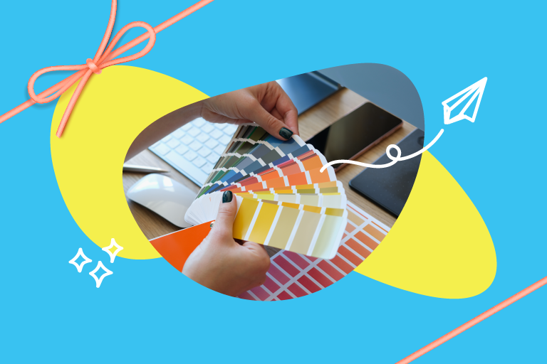
The next trend we expect to see more of is free-form photo cropping. By this, we really mean more organic shapes will be utilized to crop photography. Rather than just the basic square or circle crop we’re all used to seeing, brands will start cropping photos to shapes that more closely align with their overall brand aesthetic.
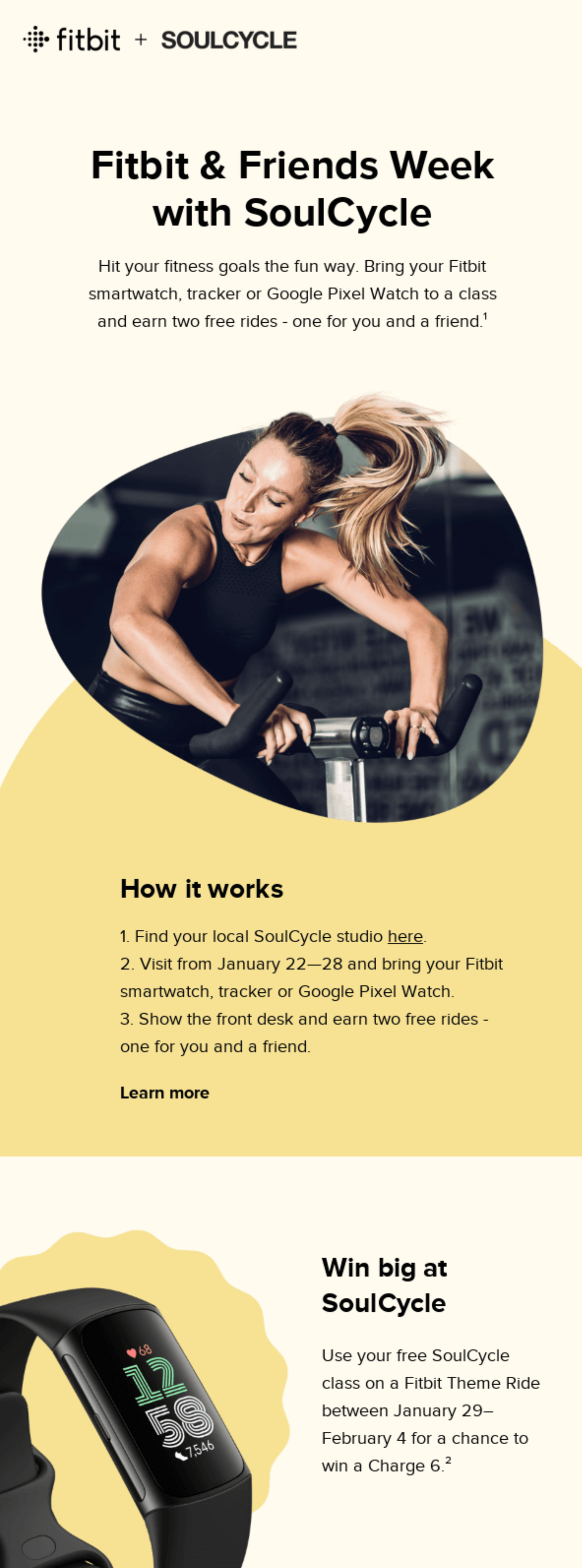

Fitbit and Soulcycle use unique shapes to crop the image of the instructor. Source: Really Good Emails.
Take this co-branded email from Fitbit and Soulcycle, for example. Where they could have placed a full width rectangular image, they instead cropped to an organic, rounded shape. This shape adds a bit of interest and, because they cropped the image in a way that breaks the borders of the shape, it adds dimension.
3. Hand-Drawn Illustrations
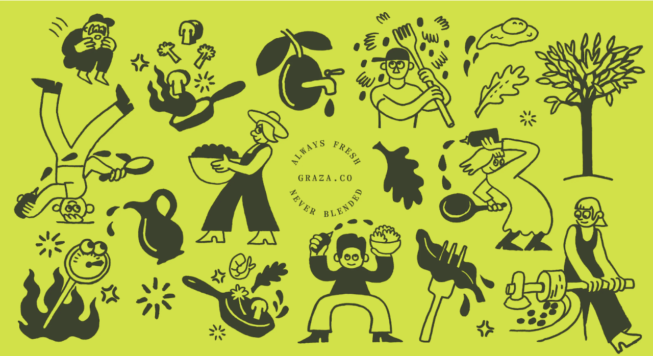
In what our Social Media Manager, Bri, referred to as “The Graza Effect,” we expect to see a lot more hand-drawn illustrations in emails and other marketing communications. These custom illustrations help develop strong brand identity and individuality. The Graza Effect is named after Graza olive oil, a brand that’s now synonymous with these custom drawings.
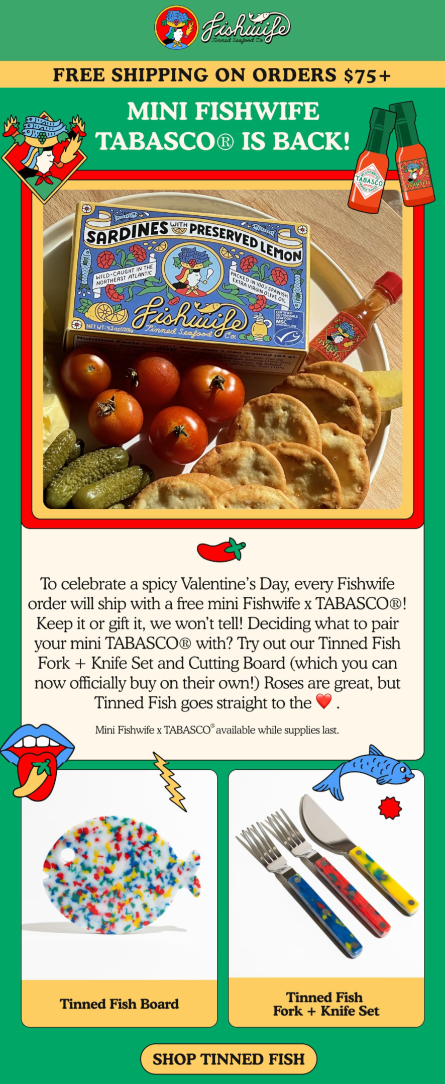
But, of course, Graza isn’t the only brand utilizing these types of drawings in their marketing messaging. Fishwife, a female-owned tinned fish company uses a similar aesthetic in their branding.
These illustrations are appealing to brands because they’re completely unique to the individual brand. Gone are the days of stock photos. Custom drawings are in.
4. Diagonal Lines
Another 2024 design trend we expect to see a lot more of is diagonal lines. Adding diagonal lines to designs makes them a bit more interesting. “Diagonal lines have the most capacity to lead the eye and they tend to make a design or image look more ‘dynamic.’ Since they are neither vertical nor horizontal, diagonal lines can seem unstable, like they are about to fall or they are moving somewhere. Diagonal lines can also show perspective. These lines lead the viewer into the image.”
In this example from Nando’s, diagonal lines are used to separate the various content modules in the email. In a traditional email you’d see straight lines separating each section, but by including diagonals the email is more interesting.
5. Coquette
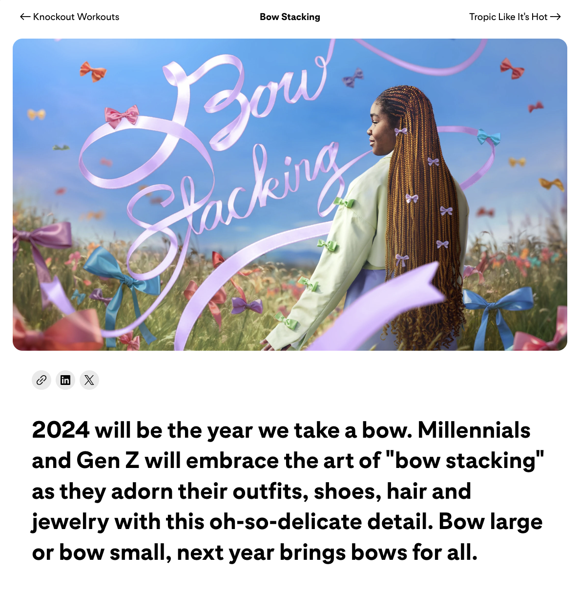
We couldn’t not talk about the coquette trend that’s sweeping social media. According to Buzzfeed, “The term ‘coquette’ refers to a ‘woman who flirts,’ but the trend leans more into incorporating playful, romantic, and dainty details into everyday style and decor.” Bows have become synonymous with the coquette trend and we’ve seen this play out on Tiktok—from people putting ribbons in their hair to tying ribbons around food.
One trend that Pinterest Predicts called out, in relation to the coquette trend, is “bow stacking.” Basically, this means wearing a bunch of bows either in one’s hair, as part of an outfit, etc. We wouldn’t be surprised if we end up seeing bows in brands’ marketing communications.
Design Trends for the New Year
As we picked out some of these trends, we started noticing some overarching themes. This year is not about quiet design. Gone are the days of “millennial gray”—brands are learning to embrace bold, bright colors and shapes.
We’re also noticing a desire for individualization. Just as customers expect to be treated like individuals, brands want to be recognized as unique—standing out from competitors. Hand-drawn illustrations really lend themselves to individualized brand identities because they’re truly custom for each brand. Brands are leaning away from downloaded icon packs and creating their own. Iconic, really.
Now’s the time to set your brand apart. Embrace these trends but really make them your own. Use these trends to develop a strong brand identity and keep it consistent throughout all of your marketing communications.
To learn more about creating consistent cross-channel marketing communications, schedule a custom Iterable demo today.
