One of my least favorite parts of engineering is having to deliver the news that what seems like a small feature request cannot be done without significant effort, or maybe should not be done due to the amount of regression risk the refactor would introduce. It reminds me of the joke about a tourist wandering through the countryside:
Tourist: “How do I get to London?”
Local: “Well I wouldn’t start from here…”
With that in mind, here are five ideas for React component architecture that might save you from starting in the wrong place.
- Avoid heavy use of props for styles
- Use partial application to create variants
- Components are not layouts
- Compose at the point of use
- Render children whenever possible
Ideas for Flexible React Architectures
1. Avoid heavy use of props for styles
A common source of component complexity is when props are used to imperatively trigger visual treatments. Prop values should declare the state of the component, and not be used as escape hatches to manipulate the CSS treatment.
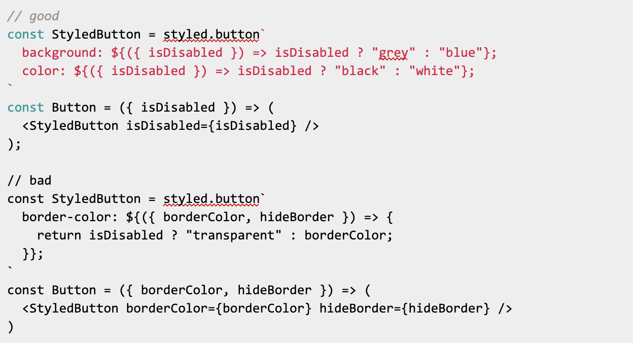
The temptation to reach into a component and manipulate a granular CSS property can often be “design smell” and indicate that the visual design system is either inconsistent or not well mapped to the states of the component.
Things to consider:
- Am I defining the state of the component? Or telling it how to do it?
- Will this prop value change over the lifecycle of the component?
2. Use partial application to create variants
One way to improve the ergonomics of React components is to pre-apply known prop values into a descriptively named component that maps to a specific use. In the following example, an underlying <Button /> component exports variants that require less configuration at the point of use, and produces clean, declarative code.
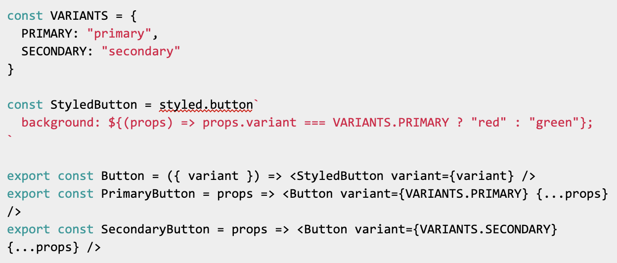
A strong design system will often define these variants in advance of implementation in a specific view. It’s important to know beforehand if these styles will need to adapt to changing prop values being fed into the component. If so, partial application is likely not the best approach.
If the style rules are complex, disaggregating the styles that are independent of the lifecycle can reduce the complexity of the component’s states.
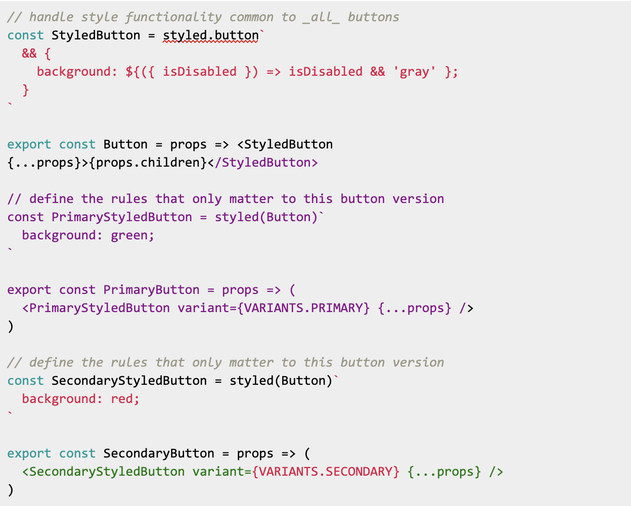
Things to consider:
- Will this variant be static over the life of the component? or will it need to changed dynamically with prop data?
- Can the visual states be clearly differentiated to simply render logic?
3. Component are not layouts
Another way that components fail is if sizing constraints, or spacing relative to other components, are hard coded into the component itself. Besides the headache of managing collapsing margins, core components often end up included in other components where external margins can cause problems.
Explicit widths rarely perform well in responsive layouts, and can cause issues if the component needs to be nested inside another component with a width limitation. If an explicit width is required, either provide a one-off width at the point of use, or ensure that the component is top-level and unlikely to ever be contained in another component.
Just like the solution to managing state in React is to lift it up from the component, lifting layout constraints away from a core component will make it simpler and more maintainable as well.
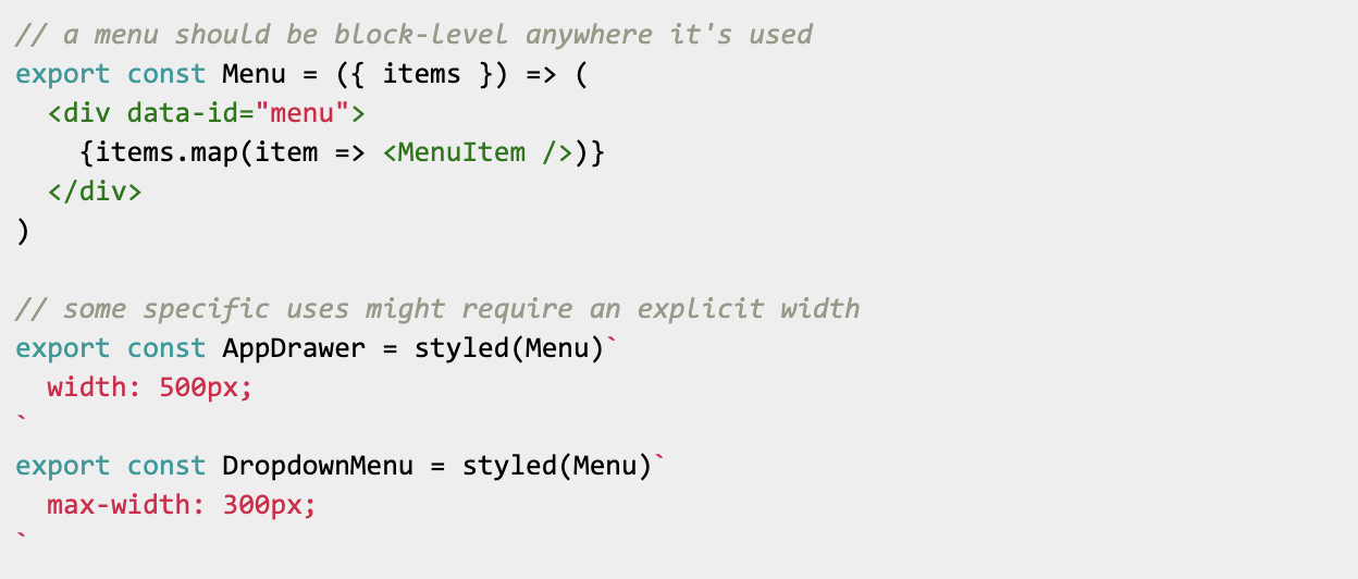
Rules:
- Don’t include external margin on the component
- Always expect a component to expand to 100% the width of its container
- Create one-off containers at the point of use for unique constraints
4. Compose at the point of use
Often it’s tempting to optimize for the terseness of code at the point of use instead of for flexibility in component composition. Consider the following:
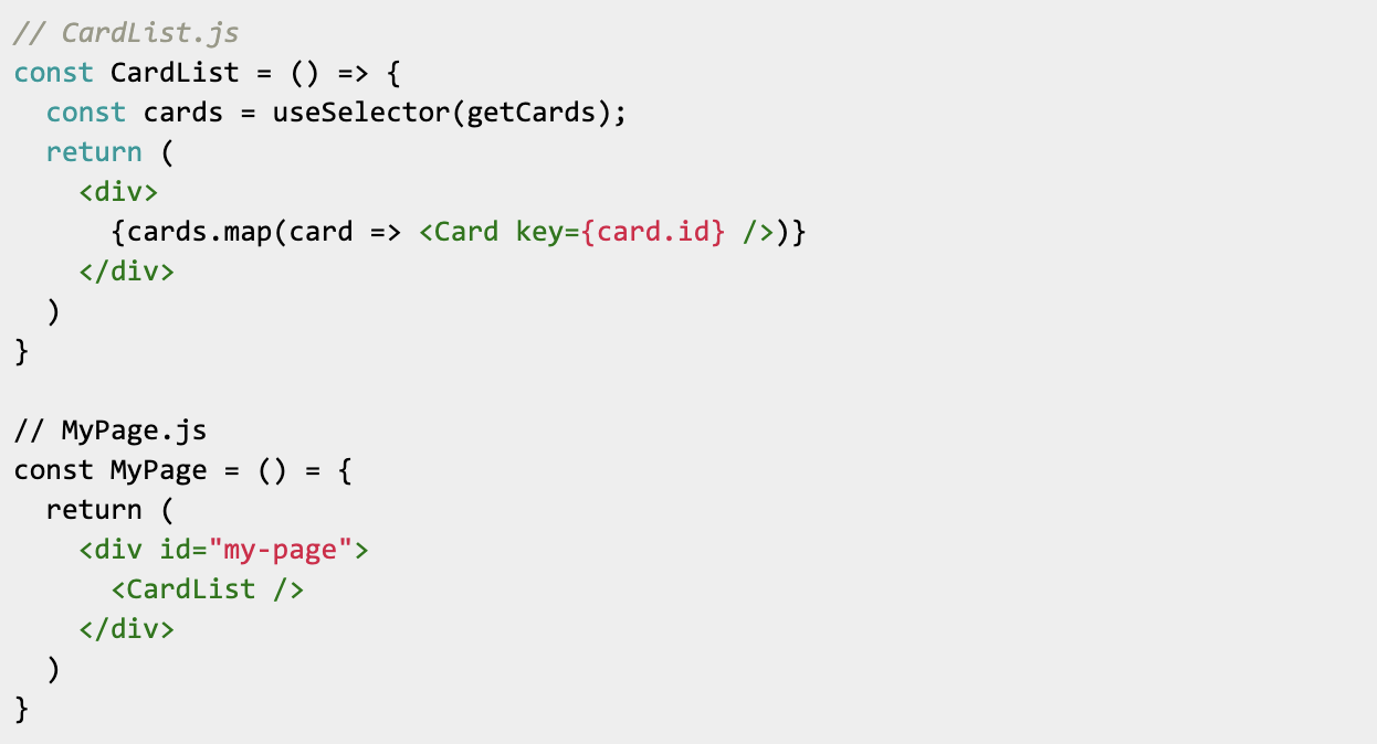
Really clean at the point of use, but what if I want to control between two different card types?
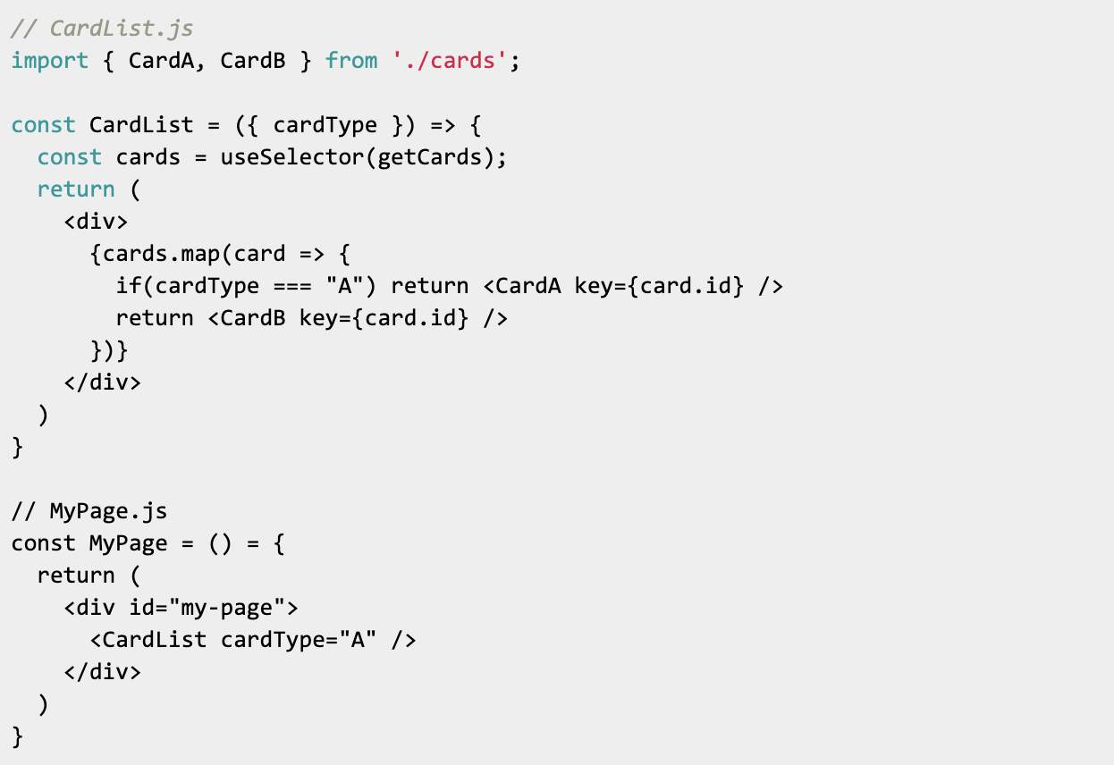
And then what if I want to filter the cards based on the state of some other component on the page?

You can already see that I’m starting to pass a lot of information around. The page calls the card list and tells it what kind of card to render, and it also provides a filter function that, while flexible, starts to add complexity inside the component.
Now, what if I have a new view where I want to render <CardC />? I’d have to reach into the component and add new conditional logic to render the proper card variant. As the logic here becomes non-trivial, the code becomes harder to follow and introduces regression risk to every instance of the component whenever it’s touched. Luckily there’s an easy solution.
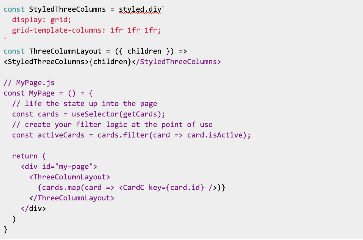
I’ve now made the code at the point of use more verbose, but I’ve significantly reduced the overall complexity in the system. My <CardList /> has abstracted away into a more generalized component to <a href=”control the layout of the cards, I’ve gained the flexibility to use this layout with any subcomponent I need, and I’ve decoupled rendering the data from performing operations on the data. And this brings me to my last point.
5. Use “children” whenever possible
The last rule is one of the most important. Whenever possible, aim to allow flexibility in what a component renders. Even trivial assumptions can get baked into the code when you’re not looking.

What happens if we want to add an icon along with the text? We have to modify the base component:

But now what if the icon is in the trailing position? We need to modify the component again, and figure out where the <Icon /> should go. Using children solves all of these problems.
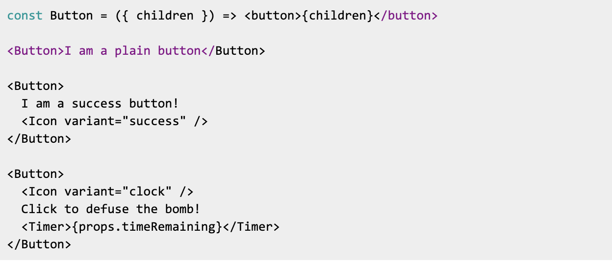
And if you ever feel the need, it’s much easier to lock down a component using the partial application strategy described above than it is to open it up.

Things to consider:
- Is your component only passing along information? or changing it?
- How much variation can you expect in the rendered markup?
- Can I “lock down” a flexible implementation to solve my immediate need without constraining all future uses?
Conclusion
Much like “no plan of battle survives contact with the enemy”, it’s rare for even carefully thought out design specifications to anticipate all future use cases. Thinking in advance about how a component might easily accommodate different design needs will help keep your implementations from being too opinionated, and save you time down the road.
Note: these examples use Styled Components for illustration, but these approaches should be agnostic to the CSS-in-JS solution you use.
