
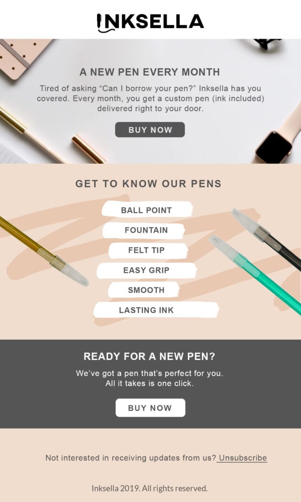
There’s no getting around it: your emails have to look great on mobile. According to Fluent, 75% of consumers say they check emails most often on their phones.
If you want optimal functionality (who doesn’t?), a mobile-first design is the way to go. You’ll also reduce the need to code mobile swaps, which cuts down on production time.
Ready to improve your mobile-first design? Keep these points in mind.
1. General Device Settings
As of 2018, the standard iPhone and Android device size measures 375px in width. But there are older devices in use that are around 320px.
The standard size for desktop is 1400px; however, email sizes are generally no wider than 600px to accommodate the left panels of Gmail and Yahoo.
Generally, an application’s mailing details take up the first 33% of the screen. And the “above the fold” content appears in the latter two-thirds of the screen.
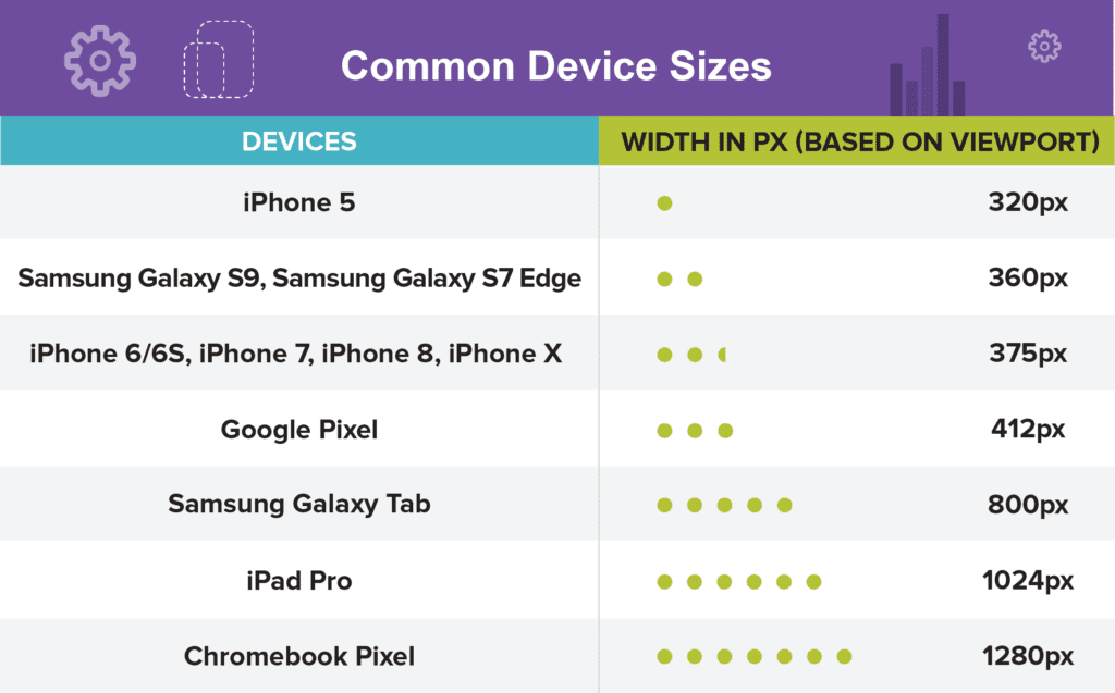
And here are more common device sizes.
2. Creating Mobile-First Email Assets
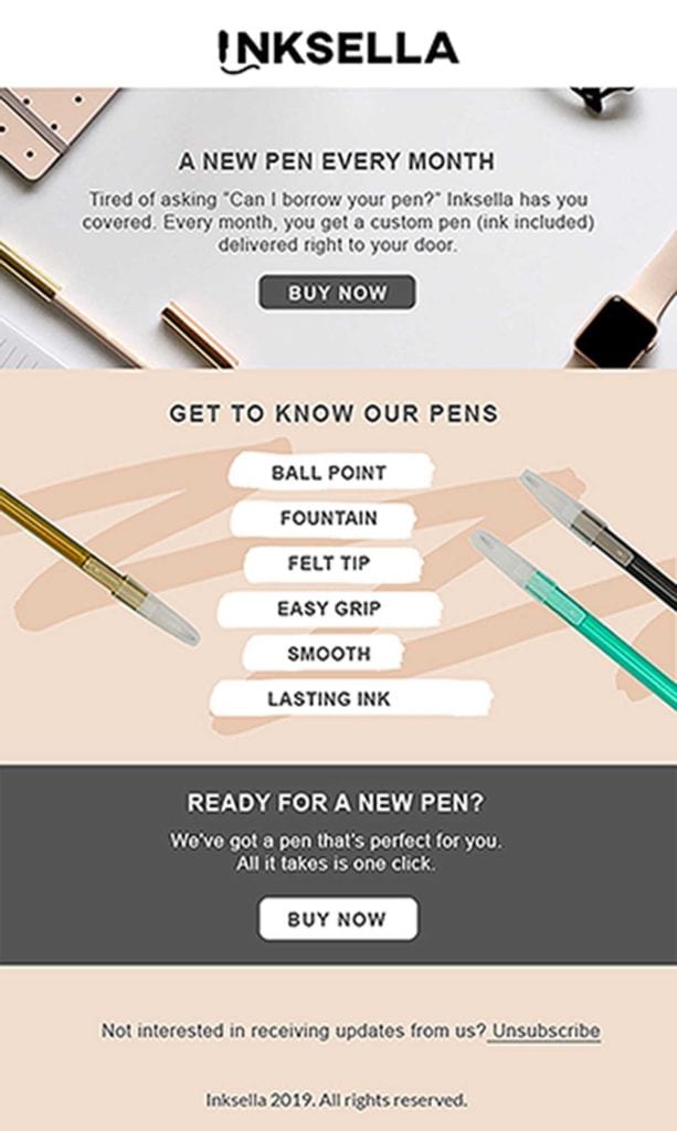
Due to various screen sizes, rendered images can look pixelated or blurry when scaled down. To prevent this from happening, create assets that are 2x in size.
As an example, if your base template width on desktop is 600px, scale your images to two times the size of the base, which is 1,200px.
3. Maximum File Size
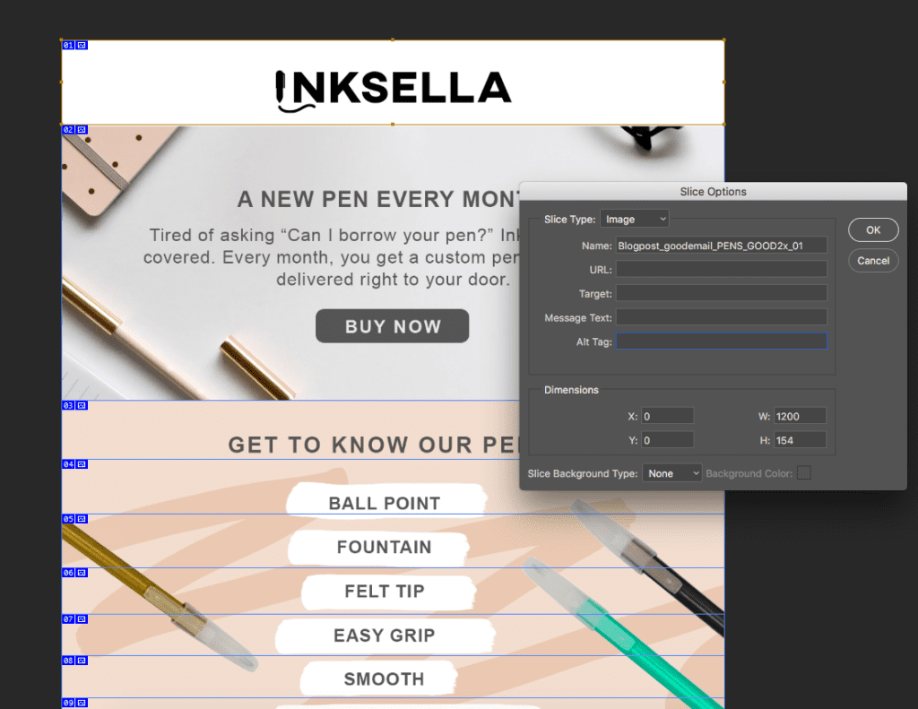
3G connections can leave consumers feeling…disconnected. And others deal with limited 4G connections when riding public transit. While 5G is great, you still want to ensure that images load quickly for everyone, so it’s best to slice your email into sections based on file size. Always optimize for all connection speeds to ensure a smooth experience.
You can easily make slices using programs like Photoshop or Sketch. Remember, you might have to slice headers and footers separately, or divide large images into subsections. If you do this, be sure the dimensions of every slice end up being an even number.
Sizes to remember:
- JPGs and PNGs should be no larger than 500KB
- GIFs should be no larger than 600KB
Once you’ve finished slicing, you can add the images one on top of the other in your email builder. Or simply incorporate style=“display: block;” into your HTML img tags. The individual slices will seamlessly form a whole picture.
If an image is too large, it could freeze during loading and display as a blank space.
Limiting the file size of images doesn’t just create a better user experience; emails that load quickly improve deliverability, which can help boost your sender reputation.
4. Maximum File Size of Overall Email
From a code and asset size perspective, there’s an optimal upper limit for the total size of an email. Gmail tends to “clip” emails that are greater than 2MB. Meaning, the content is hidden past a certain point.
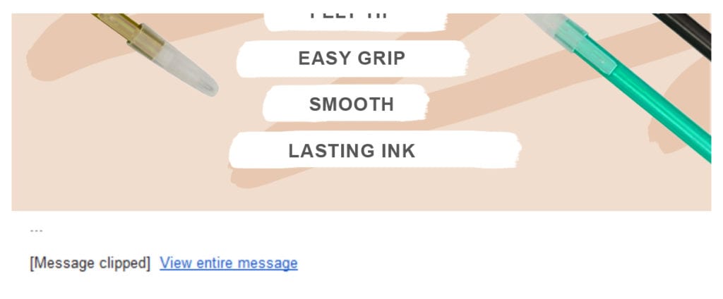
No one wants to play hide-and-seek when reading emails. For the best results, use shorter, lightweight templates.
5. Benefits of Live Text
Live text, also known as HTML text, is like the text you type into a word processor. It works well in terms of deliverability and the 70/30 rule of email: 70% text, 30% images. This is the sweet spot that makes emails more accessible to consumers in 3G networks.
Live text also scales perfectly from desktop to mobile. And from a process standpoint, copy edits can be made without having to run through a redesign of the assets.
When coding live text, follow these guidelines:
Minimum live text font size:
- 16px for mobile and desktop
- Use a line height that’s at least 6px greater than the font size
For text that is part of an image, see the specs below:
Minimum font size:
- 18px @ 1x, or 36px @ 2x
6. Designs That Don’t Work for Mobile-First Emails
Some design elements don’t take too kindly to mobile devices:
- Emails that are designed like a website
- Text that is too small for mobile. Avoid forcing viewers to zoom in to read copy or access the navigation.
- Too many CTAs require the consumer to scroll to take action. Keep all critical information above the fold.
In our experience, the average user spends about 2 seconds on an email. To get the most out of this tiny window, keep your emails simple and scannable. Focusing the content around one or two CTAs will help you follow these principles.
Why Should You Choose Mobile-First?
75% of consumers say they check their email most often on their phones. To reach them, your emails need to provide great readability on any device. Going mobile-first is also a huge time saver. After all, your creative team just has to produce one template for all use cases.
If you’re into great functionality, shortened production times, and awesome looking emails, there’s only one way to go: mobile-first.
To learn more about how to create the best mobile-first emails, schedule a demo today and check out Ragnarok’s leading email marketing services for improved email management, design, and migration support.