This guest post is by 99designs, the world’s largest on-demand design marketplace, connecting a global community of freelance designers with businesses of all sizes to complete their design needs.
Like most people (and companies), we have a love/hate relationship with email at 99designs. We love it because it’s one of the most direct ways to connect and engage with our customers and potential customers. And “connecting and engaging” in growth marketing parlance tends to come with some pretty good financial returns.
We hate it because email marketing is a frustrating process. You’re constantly struggling to find the perfect subject line to make people open; wading through archaic, messy, table-based HTML that no developer at the company wants to touch; and living in fear of your work being filed into The Dreaded Spam Folder.
But the same way I used to force myself to eat broccoli even though I didn’t really love it, as a content marketer I’ve also forced myself to choke down some email marketing. And also—like broccoli—I’ve realized that when prepared right, it can actually be pretty tasty.
Our Email Marketing Headaches at 99designs
99designs is the best place to get graphic design done online.
Okay, maybe I’m a bit biased, but we really do offer a unique way to connect people with designers. Whether you need a logo design for your startup or are looking for someone to illustrate the book cover of your self-published novel, we have a designer who can do it.
If you want designers to pitch creative ideas unique to your product (and then pick the best one), then you can launch a contest. Or if you’d rather work with an individual freelance designer we can help you make the right connection.
From a practical standpoint, we’re both a marketplace and a unique product, and that makes email marketing difficult. Running a design contest on our site is a multi-day, multi-stage event with lots of emails sent to help guide customers through the process. Of course, we also maintain a list of prospects whom we want to become customers.
And, oh yeah, we have hundreds of thousands of designers who are entering contests and creating designs. We also have to send them emails about the process, and also make sure they feel like they’re part of a community and have resources to educate themselves and grow their skills.
Email marketing has been a big contributor to our growth for several years now, but it’s also really complicated. And as we’ve grown, the number of people involved in email on a regular basis has grown as well.
At the end of 2016, we were banging our heads against the wall with our previous email provider. It was not intuitive to use and was requiring way too much engineering time to support.
We wanted a solution that would allow the marketing team the autonomy to execute campaigns on their own. It needed to be simple enough to use so that we could focus on creating great content instead of technical execution. And it needed to have advanced features which would allow us to get creative with segmenting our audience and controlling our sends.
So that’s where Iterable comes in.
We transitioned to using it in the first quarter of 2017. And it’s met our needs and allowed us to focus on evolving our email marketing strategy.
Our Email Marketing Past
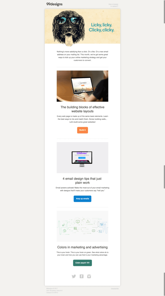
Our prior email marketing strategy was promotion-heavy. We’d send dollar-off deals or upgrade offers out to our prospects list about once a month. We slowly started adding some content-focused emails into the mix.
These early newsletters consisted of three articles from our blog that we thought were interesting. And these always performed well (both in terms of opens and, somewhat surprisingly, last-click sales) so we knew there was potential here.
One of our goals in 2017 was to find a new source of email addresses. Previously most of the addresses our prospect list came from people who filled out a design brief and didn’t complete a purchase. But if we really wanted to scale, we needed to find a new way to entice customers.
And that’s where content comes in.
A Burgeoning Relationship Between Content and Email
Our blog brings in a large number of first-time visitors to our site and has experienced approximately 75% year-over-year growth in the past 12 months.
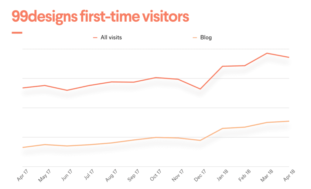
What our blog could do better is convert. We know that it has the potential. If only we could find a way to bring blog readers back to our site and remind them of how awesome we are when they’re ready to purchase…
You can see where I’m going with this.
We knew we needed to up our email capture game (and we have… we’ve almost tripled our email capture rate! But that’s a subject for another article). Now, what would we do with all these new email addresses?
Since some of us marketers still have “moral compasses,” we knew that we couldn’t just blast promos to these people. They came to our site for content, and we got their sweet, sweet email addresses with the promise of more good content, so we now had to deliver.
Revamping Our Newsletter
The goal of our new email newsletter (and the process we used to develop it) is something that most growth marketers are going to hate because it’s so smushy and based on intuition, rather than cold, hard data. But hey, sometimes that’s how it happens.
The goal of our newsletter is to build brand sentiment and engagement. Basically, we want people to be excited to read it when it shows up in their inbox, even if there’s not always something they want to read. If we can do this, we stay top-of-mind when that potential customer is ready to purchase.
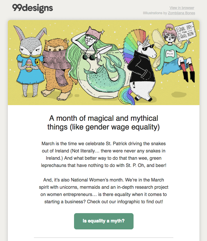
So how did we approach the process of revamping? I joined forces with our creative team and basically gave them the directive to come up with the best, most interesting, unusual newsletter template they could.
I told them not to worry about technical implementation, and that we’d figure that out later. What we ended up with was a flexible template that can accommodate many different types of content.
We decided that each email would have a theme, and that theme could be anything. So far, we’ve tried things from Game of Thrones to Money to Sportsball. Each email should also have an attractive, cohesive design (we are a design company, after all) and whenever possible we should work with designers on our platform to create the artwork.

Our formula is still not completely finalized, but we approach our newsletter by dividing it into two halves:
- Above-the-fold content includes an intro and links to 2-3 blog articles or other types of content we want to prioritize.
- Below-the-fold content is very flexible and can be anything we want that fits within the theme. So far we’ve experimented with image galleries, additional links to articles, interactive word games, and (as you can see in the Email Email example) our copywriter interviewing himself about email copywriting.
New Newsletter Performance
I would be remiss if I told you that refreshing our design and focusing on more engaging content was a magical win for us in terms of email marketing.
The truth is our results have been all over the place; we had one email with our lowest open rate ever (we think this was a spam issue), and another with the highest last-click net revenue ever. Some of the results have baffled us, and some have been pleasant surprises. At the end of the day, we’re generally trending upward, but are definitely still learning.
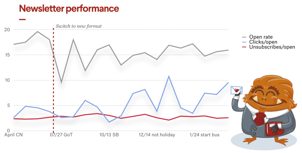
What’s been great about Iterable is how it’s allowed us to iterate on our efforts to better understand what works and what doesn’t. It’s been super easy to A/B test layout, headlines, CTA buttons, and more.
As a content marketer, I particularly love two features about Iterable: the heatmap feature, which allows us to see exactly where users are clicking, and the device testing functionality, which allows me to quickly assess if there are styling issues. These things help us understand how to design and write better emails.
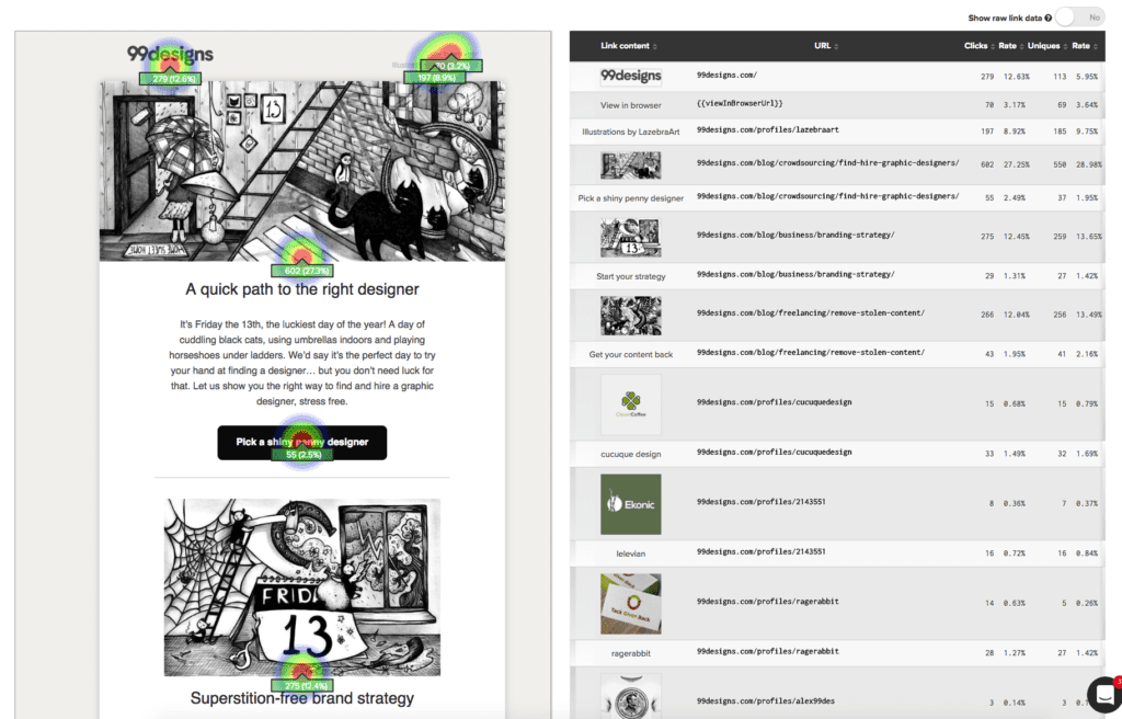
On the backend, our analytics team loves that Iterable plays nice with Segment events. This has been life-changing for both marketers and engineers as segmenting campaigns requires significantly less time to create and implement lists that include exactly the people we want them to.
We know we still have improvements we can make to our email marketing, and we’re happy to have Iterable as a tool to help us get better. And at the end of the day, that’s what matters.
 Lessons Learned
So if I had to start this process all over, what would I do differently? Honestly, the only thing I can think of is that I would have approached revamping the template with a “What problem are we trying to solve?” mentality.
We sort of charged ahead on this project from a creative mindset instead of a growth mindset, but I actually don’t think that was a problem. There is something to be said for jumping outside of the box and trying something completely different to see what sticks. But it’s also good to understand what you’re jumping outside of the box for.
In the past couple months we’ve started to better grasp where our shortcomings are with email marketing, and, thanks in part to Iterable, we now have the creative and technical tools needed to solve those issues.
To learn more about how 99designs turns prospects into customers by creating personalized content with Iterable, check out our in-depth case study.
