When shopping in-person, you find a gorgeous pair of jeans. They fit you perfectly and the wash is exactly what you’ve been searching for. You hold onto that pair of jeans as you browse the rest of the items around the store. Then, as you head to checkout, you realize not only the high price point of those jeans, but that you aren’t as obsessed with them as you were when you first tried them on. You hang them back on the rack and leave.
Online, this would be considered an abandoned cart. The customer came to your website, poked around, found something they liked, and placed it in their virtual shopping cart. As they got ready to check out, they decided they no longer wanted to buy it and left the website—abandoning the item in their cart. As a customer, it’s great to have that option. As a marketer, however, it’s hard to watch. Thus, abandonment campaigns came to be.
In our latest ebook, “Orchestrate Your Cross-Channel Campaigns for Peak Harmonization,” we touch upon a variety of marketing campaigns, including abandonment campaigns, and detail what’s required for each and some tips for building them out. This article—the third in our series—will provide context around, and examples of, abandonment campaigns.
What Are Abandonment Campaigns?
Abandonment campaigns are a direct response to customers leaving items in their virtual carts. Often designed with dynamic content, classic abandonment campaigns feature messages that include the abandoned item. So, if a customer left a pair of jeans in their online cart, you could send an email to that customer, showcasing the exact jeans they left behind—the goal being to get them to purchase.
Onboarding, welcome, and promotional campaigns can be personalized, but abandonment campaigns open the door to a deeper level of individualization. Using customer behavioral data to customize marketing messages shows the customers you’re paying attention and is more likely to improve engagement. And further down the funnel—say, right before purchase—engagement is crucial.
To execute abandonment campaigns effectively, there are four key elements you’ll need to consider: real-time triggers, visuals, unified carts, and clarity. Let’s dive into each.
Real-Time Triggers
Real-time triggers are events that can initiate a campaign, automatically, as they happen. In a cart abandonment, for example, the trigger may be the customer leaving the site with an item in their cart. This could trigger the start of your abandonment campaign. Because customers are actively interacting with your website or app when they abandon their cart, taking advantage of their engagement and acting quickly can prove to be beneficial.
We mentioned jeans earlier—well, here’s a real-life example. Clothing brand, True Religion, has three separate messages as part of their abandonment campaign. In the example below, a shopper must have left the highlighted pair of jeans in their cart and left the site. True Religion followed up with a same-day message, a message the following day, and a final message the next.
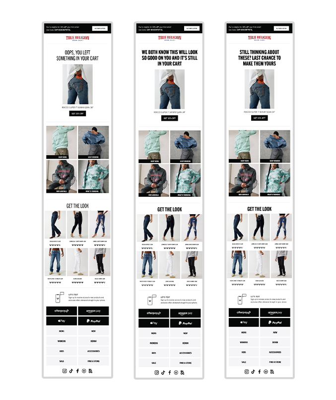

True Religion used dynamic content, pulling the exact item the customer left behind into the email—an easy way to add personalization. Source: Mailcharts.
In each message, True Religion offered customers 15% off and featured additional trending clothing items. You can tell the emails are triggered because the copy isn’t product-specific, but pulling in the product picture and description is a smart way to make these messages impactful without a heavy lift from their marketing team.
Eye-Catching Visuals
Visuals are crucial when it comes to abandonment campaigns. Maybe the customer has forgotten what they left behind. Putting an image of the abandoned item in the message, like True Religion did, can remind customers of the products they may want to purchase. Or, maybe they didn’t forget and have been considering this purchase ever since they left your site. Showing them the item again could be exactly the nudge they need to press “buy.”
Neutrogena, the beauty brand, has two emails in their abandonment campaign. The first, features a large photo of the abandoned product and, right below, some other product recommendations based on the abandoned product. The second email also features the product image but also features a bold image at the top with text reading “it’s never too late.”
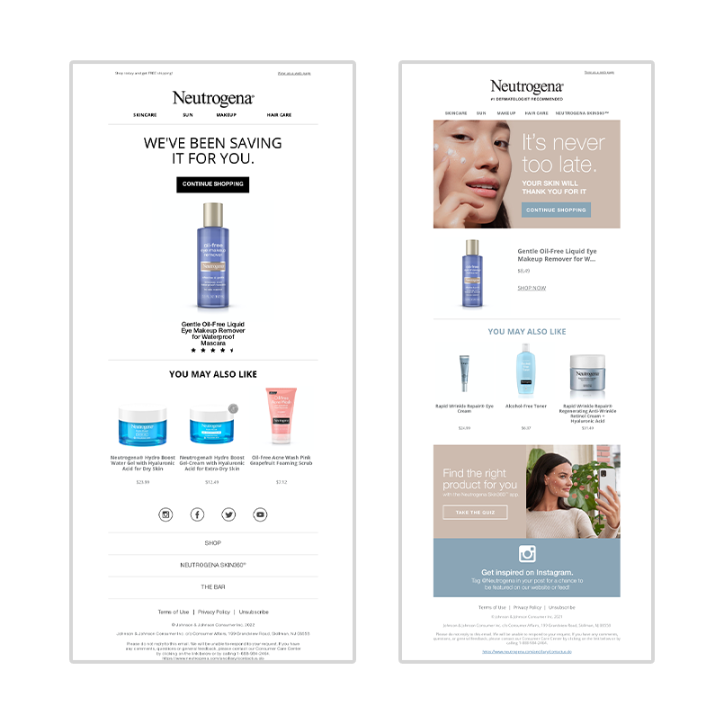

Neutrogena highlights their beauty quiz at the bottom of this email. If customers aren’t sure if the product is right for them, taking the quiz could help them decide. Source: Mailcharts.
Neutrogena was smart with their visuals because if a customer opens the first abandoned cart email and ignores it, they’d likely easily skim over an identical email. By switching up the visuals, Neutrogena is improving the chances of conversion engagement while still reminding the customer of the product they left behind.
Cross-Channel Unified Carts
The cross-channel experience can make or break a purchase when it comes to abandoned carts. Even if a customer is using multiple channels to interact with your brand, they should have a consistent experience, regardless of the channel they choose. So, for example, if your customer goes to your desktop site, adds items to their cart, leaves, and signs in later on the app, that cart should look identical to the cart they abandoned on the desktop site.
With that, messaging should reflect carts built on multiple devices. If a customer abandons their in-app cart, they should still receive your abandonment email campaign. If a customer abandons their cart on the desktop, they can still receive push notifications or SMS messages regarding their abandoned item.
With Chewy, the pet care brand, it’s easy to switch between desktop and their mobile app. As long as you’re logged into your account, what you add to your cart in the app will show up in your cart on the desktop site (and vice versa). Then, when receiving abandonment emails from Chewy, if you’re on your phone and click through the email, you’ll be taken to the app. If you open the email on the desktop, you’ll be taken to the desktop site.
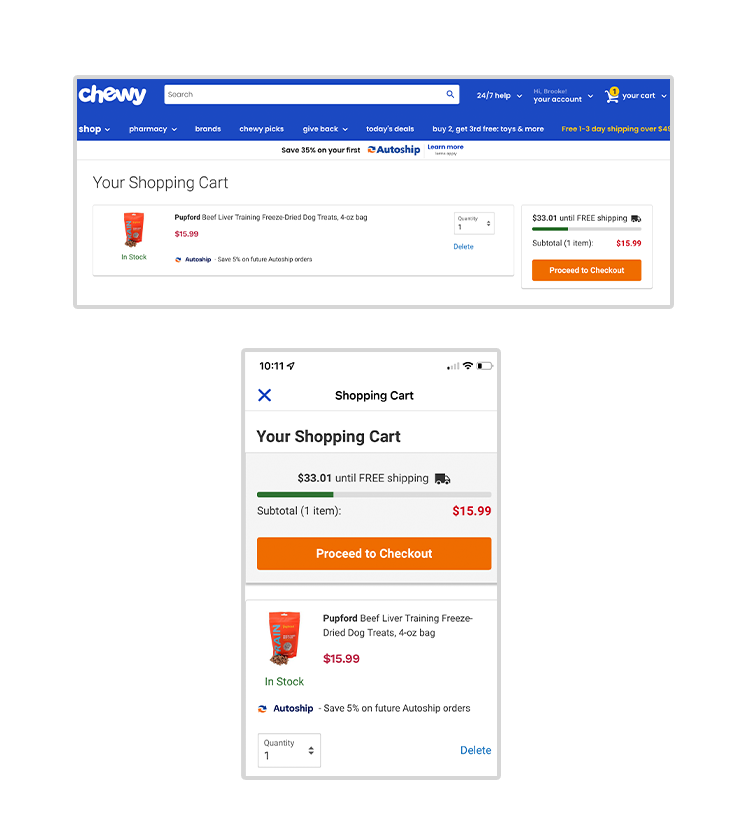

Chewy makes it really easy to switch between channels and still feel like you’re having a cohesive experience.
Giving customers the ability to switch between channels and experience a unified cart can make for a better abandonment campaign. When customers are making a purchase decision, accessing a single cart, from wherever they are, can be the deciding factor in whether or not they make the purchase. Unified carts reduce friction.
Crystal-Clear Messaging
When designing a cart abandonment campaign, the goal is very simple: get customers to buy the items they’ve left behind. Because the goal is very simple, it’s important the messaging is clear as well. Adding too many bells and whistles or introducing new goals and objectives could easily create a convoluted, confusing message.
Home furnishing brand, Crate & Barrel, makes the intent of their abandonment campaigns very clear. There are three emails in the series and each features a bold, simple headline, a photo of the abandoned item, and a descriptive CTA. There’s no confusion about where the user will be taken when they click on the message.
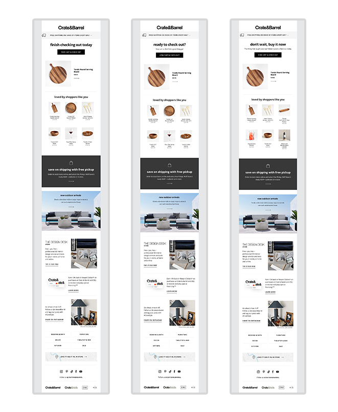

In all three emails in this series, the CTA says “View Cart and Check Out.” The CTA not only eliminates steps for the customer, but sets clear expectations. Source: Mailcharts.
In addition, Crate & Barrel uses different copy in each email headline in their abandonment series. For example, the first email in the series reads “finish checking out today.” This email was likely sent shortly after the customer left their item in the cart and implies that the customer is midway through completing their order. If the order isn’t completed, they receive different messaging. It’s a nice touch to help personalize the content.
Show Customers What to Do Next
Abandonment campaigns are used to guide customers through their journey in a personalized way. The customer is already at the bottom of the funnel, just about to convert, but, for some reason, doesn’t. Abandonment campaigns could be the final nudge they need. When developing your campaigns, make sure the next step in the journey is clear, enticing, and customized for each individual user.
With real-time triggers, eye-catching visuals, cross-channel unified carts, and crystal-clear messaging your abandonment campaigns will ensure customers are continuing along their journey and clicking “buy.” But remember, abandonment campaigns are only a small piece of the customer experience…
To learn more about abandonment campaigns, along with other marketing campaigns, download “Orchestrate Your Cross-Channel Campaigns for Peak Harmonization.”


