Over the past six months, we’ve been working hard to reimagine what our UI could be and today we’re excited to show off a new coat of paint.
Our goal was to create a cleaner, more approachable navigation bar where every campaign, list and workflow is more easily accessible at the top of your screen, opening up more space to focus on what’s important.
Here’s a quick look into our process and what to expect within the new UI.
How Did We Start?
Our main goals were:
- Simplicity: The new look-and-feel is approachable and lively. We want all users—no matter their familiarity with Iterable—to have the smoothest entry point to the platform so they can be running campaigns in no time.
- Discoverability: Our goal was to improve work processes and increase productivity in everything our customers do, which relies on them being able to find the features they need, when they need them.
- Modernization: We wanted to put an updated look to the platform to coincide with the power of Iterable.
What Were the Next Steps?
We collected and digested customer feedback in combination with internal analytics to determine our optimal path forward.
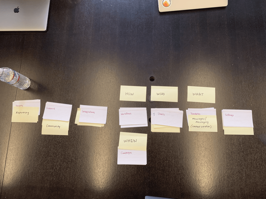
We distilled this information into our audits and user testing to define an information architecture—the What, Who, When, Why and How. It took several card-sorting exercises and over-the-shoulder labs to ensure that we were thinking at scale and not from individual perspectives.
In doing so, we avoided a common pitfall in UI refreshes—people start out too big and forget the user in the process.
Simplicity
Iterable strives to unlock creativity so marketers can imagine new templates and test new customer journeys. With that in mind, we focused on consolidating our global navigation.
We had to open up screen space and give customers the freedom to focus on their highest priorities.
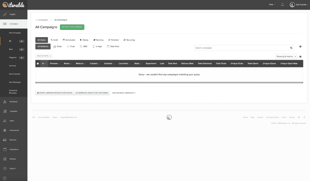
Prior to this refresh, our fixed global navigation was occupying all of the bar space on the left and top of the screen. When working on a small laptop screen, this workspace became challenging.
With our consolidated global navigation, the space to create complex workflows, campaigns and templates increases substantially, thereby enhancing visibility and simplifying the creative process.
Discoverability
With our new information architecture, we wanted to ensure that new and existing users could intuitively find their way around the platform with ease.
The new information architecture is designed with the jobs users complete in Iterable in mind. Thus, aligning our UI with the new information architecture removes any complexity from moving around within the platform.
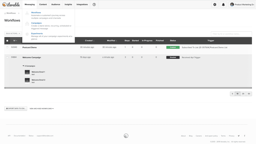
We have grouped all associated jobs together in their own tabs for easier productivity. Below are four key tabs and which questions the associated jobs answer.
- Audience: “Who am I messaging?”
- Messaging: “When and how am I defining communicating with my users?”
- Content: “What am I sending my users?”
- Insights: “Why did I send that message and what are the next steps?”
Settings, account management and notifications are also organized to be more contextual and easily accessible, but not intrusive to the flow.
Looking at the usage metrics, we realized that project-switching was a highly utilized feature so we gave it some extra love by adding a search bar so you could locate your projects with ease.
With these updates to the discoverability of features, the Iterable platform makes it easier for users to be organized and productive.
Modernization
Part of making the user experience intuitive is to leverage the patterns and habits users have already developed.
We have incorporated similar, user-driven UI patterns in this refresh to ensure that users can utilize their own knowledge and orient themselves quicker and easier. To visualize this, we chose a horizontal layout, emphasizing the real estate for creation and interaction with the product.
We also highlighted our main features and pages using iconography and a brighter treatment—in addition to new descriptions. This resulted in better clarity around specific features and pages, what they can do, and what value they can bring to the marketing process.
We worked with our branding team to understand our brand personality and apply it to our UI. While, visually, our previous navigation utilized colors from our brand, it did not align with our brand personality.
With this refresh, we kept within our brand colors, but opted for a lighter, brighter approach, so that the Iterable experience is more cohesive and approachable for marketers.
How Did We Test Our Hypothesis?
For a change this large, we wanted to take feedback from every customer into account.
We launched the updates in a progressive product experiment where we randomly added customers to the experiment. However, we gave individual users the option to opt-out if they were not enjoying the experience.
Each week we would add a new set of customers after measuring the retention rate.
We guided all customers involved in the process by launching a walkthrough that would introduce them to the changes. The result of careful planning and execution ensured a smooth experience for our customers and we received an overwhelmingly positive response.
Results
Our opt-in experimentation paired with the progressive roll-out allowed us to discover and address user concerns early, while testing long-term user preferences for the UI. We averaged a weekly retention rate of 99% for the new UI.
Our focus at Iterable is empowering our customers to achieve more with their marketing campaigns. This is only the beginning and a UI refresh is a big step in our journey to create the ideal modern growth marketing platform.
Current Iterable clients can learn more about our latest UI refresh by joining the Iterable Community and chatting with fellow users and members of the Iterable team.
New to Iterable and want to know more about our platform? Sign up for a demo!