As mentioned in the first part of this series, each channel’s user experience (UX) is a building block to creating an optimal customer experience (CX). Customers bouncing from channel to channel along their lifecycle journey need to be met with a consistent, frictionless experience. This holistic approach to the customer experience builds better relationships with your customers and increases customer lifetime value (LTV) as a result.
In our exploration of desktop UX, we learned that consumers generally use a desktop site when completing important tasks. Bigger desktop screens are preferred to provide more context in a single view and are often used for absorbing vast amounts of information. But what’s the next step? What happens when the research is done?
Knowing that each channel’s UX plays an integral role in the overall customer experience, we want to take a closer look at a channel that’s getting all the buzz these days: mobile.
The Draw of a Mobile Site or App
Mobile sites and apps are valuable ingredients in creating a beneficial customer experience because they’re always available to consumers. These days, everyone has a phone in their pocket, so, as a brand, being able to always be with the customer is a huge plus for marketers.
Not only do consumers have phones with them, they use them…a lot. “According to a survey conducted in February 2021, nearly half of the respondents stated that on average they spent five to six hours on their phone on a daily basis, not including work-related smartphone use.”
The way consumers use mobile is very different from how they may use a desktop site. A study from Google and AnswerLab notes, “mobile users tend to be very goal-oriented—they expect to be able to get what they need from a mobile site easily, immediately, and on their own terms.” So while desktop may be the first step in a customer’s buying journey, your mobile site or app may be the last step.
Because of the sheer abundance of apps available with the swipe of a finger, your mobile experience needs to stand out—it should be designed in a way that enables the user to act quickly, with confidence.
Instilling Confidence Through Your Mobile UX
With mobile being the platform where end transactions take place, it’s vital that your mobile UX instills confidence in the user.
First off, for a holistic customer experience, your mobile site has to be familiar to the customer. This means the branding should be consistent with your other channels. If your mobile site looks different from your desktop site, in terms of brand colors, fonts, and even site navigation, it’s going to immediately raise some red flags with users. It could prompt thoughts like, “Is this really the same brand I was looking at on my laptop?” Not a huge confidence-builder.
Next, your app can’t be pushy. Even though users may end their buying journey on mobile, it can’t be forced. When someone opens your app or loads your mobile site for the first time you should ease into the transaction versus requesting money upfront, which will also raise red flags.
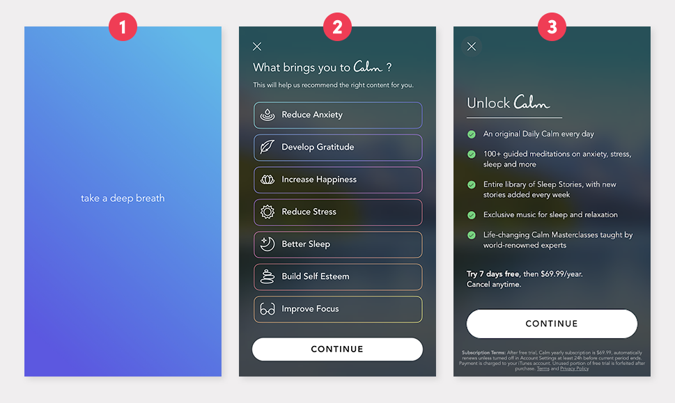
Calm, for example, prompts users to take a deep breath. This is the first interaction users have with their app. Then, the user is asked what they are looking to gain from the app. This ensures users that the app has what they are looking for before they sign up.
Only after the cleansing breath and preference page are users asked to sign up. People looking to use Calm are likely looking to assuage their stress and anxiety, so having this onboarding process shows users that Calm cares about their wellbeing.


Calm’s app has a UX that matches the brand’s goal of providing relaxation and alleviating stress. Source: ReallyGoodUX.
Instilling confidence in users will improve your mobile experience, but how do you get users to your app or mobile site? Remember that mobile is just a piece of the cross-channel customer experience.
Marketing Channels as an Extension of Mobile
Not only are the sites and apps themselves important for engaging customers, but you can also tap into mobile marketing channels after incorporating a mobile site or app into your marketing strategy.
Once you have an established mobile experience, you can bring customers to it (and keep them there) via SMS, push notifications, and in-app messaging. To go a step further in creating a seamless customer experience, you can incorporate deep links. Deep links take the customer directly to the view of your mobile experience that relates to your marketing message.
For instance, as a footwear retailer, say, you send a push notification mentioning a specific sneaker. If a customer were to click on that push notification, containing a deep link, it would open your app and bring them directly to that sneaker’s product page.
These marketing channels help meet the customer where they are—and in the case of deep linking, you get to influence where they go. They’re on their phone, so being able to lead them directly to an optimized mobile experience shows that you’re paying attention to their engagement habits.
The CX Impact of A Well-Designed Mobile UX
Mobile sites and apps are modern. If a user is researching your products on a desktop site and later wants to browse on mobile, only to learn your mobile site is just a hard-to-read version of your desktop site, it’s going to degrade the entire experience.
Having an established, streamlined mobile experience shows users you’re paying attention and care about them. Developing a mobile UX adds more depth to the customer experience—they can get to your brand whenever they need to.
To learn more about mobile marketing channels and how to integrate them into your marketing strategy, request an Iterable demo today.


