You forgot something! Like what you saw? Still thinking about {{insert product here}}? We’ve got your back. Chances are you have received—or written—a message with one of these subject lines from an abandonment campaign.
Unlike welcome and promotional campaigns, abandonment campaigns—whether designed for shopping carts, browsing or form-fills—seem to be stuck in a content rut. They’re almost stale.
Since the core purpose of an abandonment campaign is conversion, this uniformity somewhat makes sense. The messages feel almost transactional in nature, and we can all attest to the oft blandness of a transaction/confirmation/verification message.
Today’s consumers have different expectations. They want more from the brands they deem worthy of their time and money. Consumers want from brands the same thing they want from their friends: someone who listens and pays attention.
The abandonment campaign is arguably the most direct way to signify that you are paying attention to your users, their wants, and what makes sense for their journey with your brand.
Below, we’re going to walk you through three ways to flip the script and turn your abandonment campaigns into something unique and memorable. But first, check out this quick video to get a foundational understanding of what is needed to build an ideal abandonment campaign.
Wonderful. Welcome back! We won’t beat around the bush any longer. Here are the quickest—and easiest—ways to begin setting your abandonment campaign apart from the crowd.
Create a Dialogue
Understanding intent is integral to the abandonment campaign. After all, your user has shown interest in an item and got within a few clicks of actually completing the purchase! The intent was there at some point, but what exactly is that intent?
Did the user want to purchase the product? Was this purchase for them or was it a gift? Maybe they used the cart as a chance to save an item for later?
Part of the intent can be shown in your data, yes, but sometimes it’s easier to go straight to the source. Ask! Ask your users what they were shopping for and why they decided to abandon the interaction.
Ugmonk, a designer clothing and lifestyle brand, openly asks users to contact the founder about the products they had browsed and abandoned. This level of one-on-one customer service shows consumers that the brand is more concerned with the customer’s experience than completing the sale. It’s one that gives users a voice and a say in the matter that isn’t present in most abandonment campaigns.
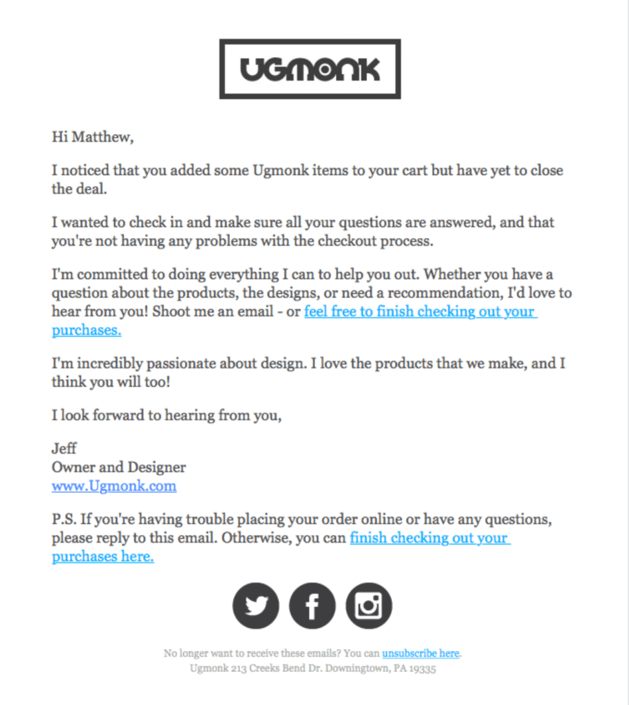

A comforting, personable tone humanizes the experience for consumers. Source: Really Good Emails
Baking a conversational element into the abandonment experience adds a level of humanity that would otherwise be replaced by strict sales tactics.
Take Real-World Context Into Account
The topic of intent above extends beyond just creating a conversation. There can also be reasons as to why a person might forego the completion of a purchase. In a year like 2020, there could be a host of reasons why someone might not be able to add another purchase.
Take this into account. The world outside the singular transaction at the heart of your abandonment campaign matters and plays a big factor in influencing the ultimate decision of your consumer. Ignoring these factors shows neglect and a lack of interest in understanding the user on their own terms.
Google’s shopping function, Google Express, touches on this concept in their cart abandonment campaign. The phrasing “We’re ready when you are” is not pushy. It shows the consumer the brand is listening but isn’t going to force a transaction on their terms. Rather, it’s up to the user to make that final decision.
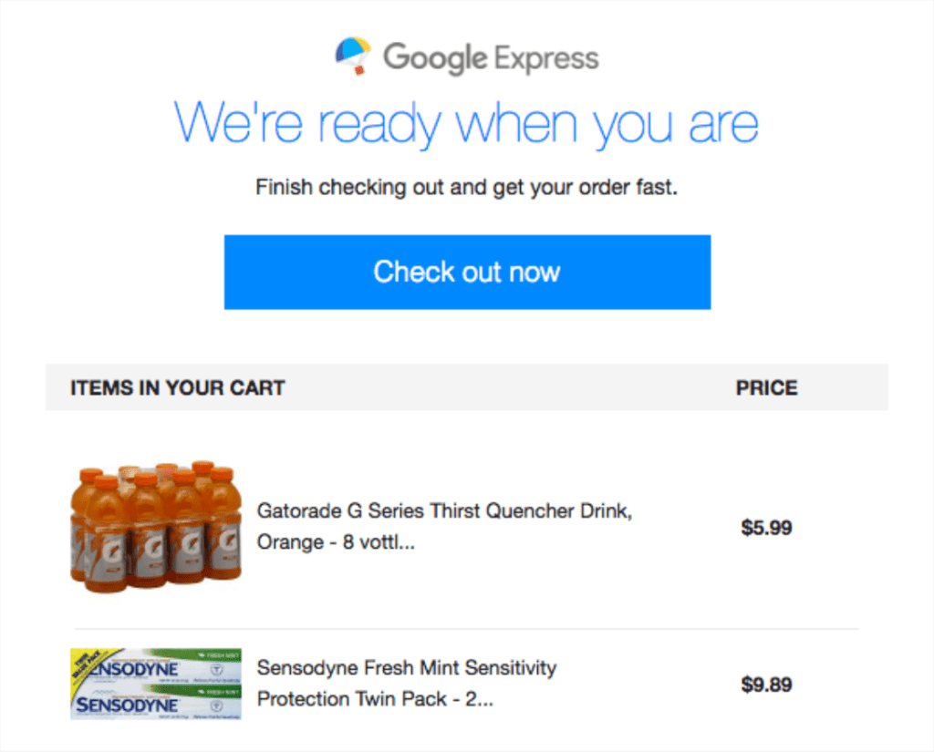

This is a simple yet successful example of more inclusive messaging. Source: Really Good Emails
Purchases don’t happen in a vacuum. Use your data to understand each user’s buying behavior to inform if any changes have occurred that might line up with impactful current events.
Put Your Products in Action
Developing a deep relationship with and understanding of your customer base requires a level of empathy that many brands don’t currently express, and must put in work to attain.
With that in mind, we thought we’d close this list out with a tip that most businesses can implement more quickly. When building out your abandonment campaigns, consider imagery that gives your products a place in the real world.
Abandonment campaigns as we often see them—if they include imagery at all—put the abandoned item in a white or black void as if to say, “Here it is. Want it or not?”
When considering a purchase, though, users aren’t thinking about the item in a void. There’s a purpose. This purchase will fill a need (let’s be honest, probably a want). Help them see this!
Luxury leather goods maker MCM leans towards this concept in their abandonment campaign. While they don’t explicitly include the abandoned items in their contextualized imagery, they provide a closer enough approximation that you as the consumer can begin to see yourself walking around town with one of their stylish bags.
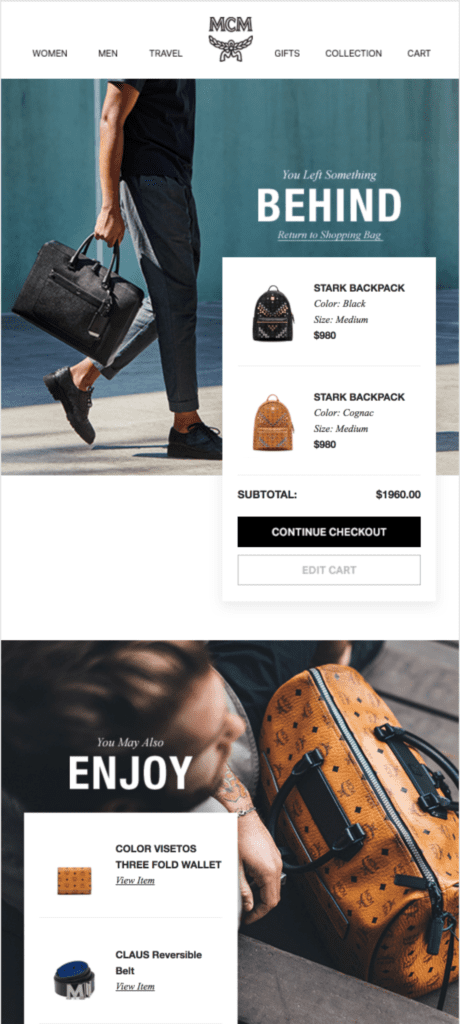

Contextualized imagery also helps in promoting brand identity. Source: Really Good Emails
As you can see from this MCM example, it doesn’t have to be a direct comparison. As long as the user gets the feel of taking the product off the screen and into their own life, you’ve achieved success.
Buck the Trends
The abandonment campaign doesn’t have to be rote. The elements outlined in the video above may stay the same, but the ways in which you connect with your customers can be uniquely your own.
Taking the time to give your abandonment strategies a refresh shows your customers you are listening and paying attention. Adopt the strategies above, and you’ll catch their attention too.
Don’t let your campaigns lose their luster. Check out our guide on giving your marketing a red-carpet makeover!
