We’re all familiar with the cart abandonment email. Whether as marketers or as shoppers we all know the classic “you’ve left something in your cart!” subject lines. Because abandoned cart emails get all the glory, we want to focus on the lesser-known sibling of the cart abandonment campaign: the browse abandonment campaign.
Abandoned browse messages are usually sent after shoppers have been bouncing around your site (or app), from product page to product page, but then, before they actually add anything to their cart and checkout, they leave.
From the jump, it’s clear that abandoned cart and abandoned browse campaigns are reaching shoppers at different stages in their buying journeys. To better understand when to send one or the other and what they should look like, we have to dive deeper into what causes someone to abandon browsing and abandon their cart in the first place.
Why They Abandon Us
A user who abandons their cart is much farther along in their shopping journey than a user who abandons browsing an item. Someone who has built a cart is close to purchasing while someone who is just browsing is often in the research stage or even just “window shopping” without the intent to make a purchase.
To fully understand the why, we as marketers have to get inside the heads of the users when they close the browser window.
Manychat highlights the reasons between abandoning browse and abandoning a cart:
Why Shoppers Abandon Browse
- Just looking for ideas
- Comparison shopping
- Product doesn’t meet needs
- Too expensive
- Slow loading site (slow-loading sites increase the abandonment rate by 75%)
- Read a bad review
Why Shoppers Abandon a Cart
- Checkout process too long
- Action timed out
- Issue with payment processing
- Are unsure of purchase
- Worried about price
- Registration requirements
- Lack of site security
- Shipping is not fast enough
Because shoppers who have abandoned their cart are farther along in the buying process and their abandonment may point out more actionable site fixes or user experience enhancements, many marketers dedicate more resources to building abandoned cart campaigns over abandoned browse campaigns.
In fact, a quick Google search for abandoned browse campaigns results in a lot of abandoned cart campaigns. But, the less popular abandoned browse campaigns are super valuable for turning those who are “just looking” into buyers.
The Impact of Abandoned Browse Campaigns
According to Salecycle, “Browse abandonment emails have an 80.9% higher open rate and 50.5% higher click through rate than traditional emails, while 26% of all browsers that open these emails will click through and return to the site.”
What differentiates abandoned browse emails? By nature, they’re personalized. They contain customer-specific information (what they looked at, when they looked at it, etc.) and that alone positively impacts the customer experience. Personalization builds relationships, promotes brand awareness, fosters loyalty, and increases repeat business.
Personalization in Abandoned Browse Campaigns
To step-up the level of personalization, your brand can implement progressive profiling to start building a customer profile based on the little information you may have collected. Every time a customer interacts (or doesn’t interact) with your brand, you have the opportunity to learn something new about them.
For example, your marketing team can make educated guesses, based on the actions of customers that are similar to this new customer, as to what the new customer may be interested in going forward. This initial data can be worked into abandoned browse messaging to make sure your customers are getting content that’s as individualized as possible in the early stages of their journey.
Connect Cross-Channel
It’s also important to remember that abandoned browse messages don’t always need to come in the form of an email. If a user has downloaded your app and registered, you could send an abandoned browse push notification. If they’ve added their phone number, send them an abandoned browse SMS. But, because an email address is usually the contact information brands collect first (think about all of those popups asking for your email in exchange for a 10% off coupon), it’s often the easiest way to contact a user.
While they don’t necessarily need to contain coupons or urgent deadlines like abandoned cart messages, abandoned browse campaigns are a nudge in the right direction. They’re a reminder of what the shopper has looked at and can encourage them to convert. Let’s take a look at some examples.
Examples of Abandoned Browse Campaigns
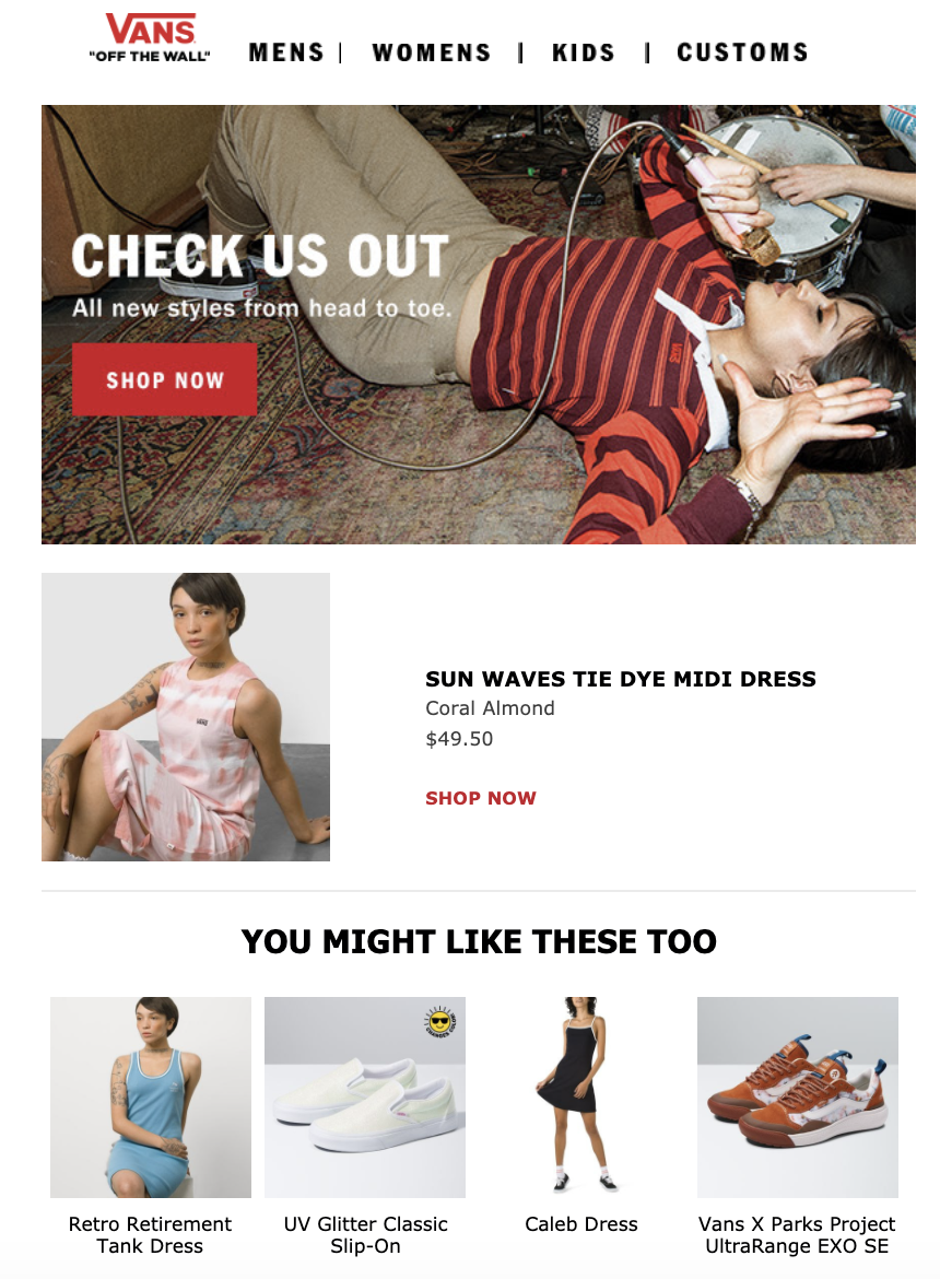
Vans, the footwear and apparel brand, understands where the shopper is in their journey when they abandon a browse. Rather than being pushy with last-minute deals, this email invites the shopper to check out new styles and offers suggestions in addition to featuring the abandoned item (Sun Waves Tie Dye Midi Dress).

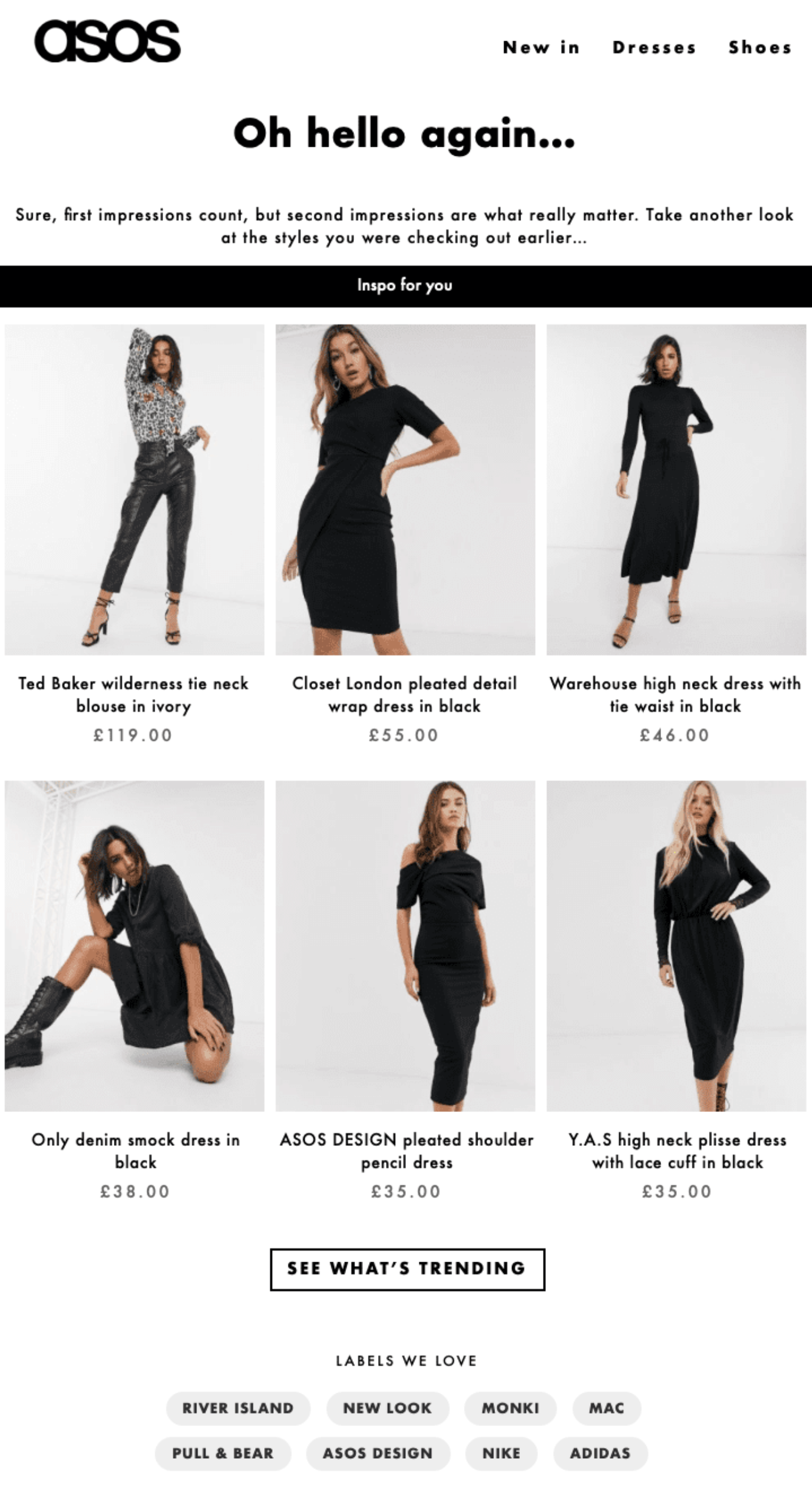
In their abandoned browse email, ASOS, an online retailer, very clearly calls out the fact that the shopper was browsing. They label the initial session as a “first impression” and invite shoppers to return to the site for a second look.
Learn more about how ASOS integrates browse abandonment into their customer experience.

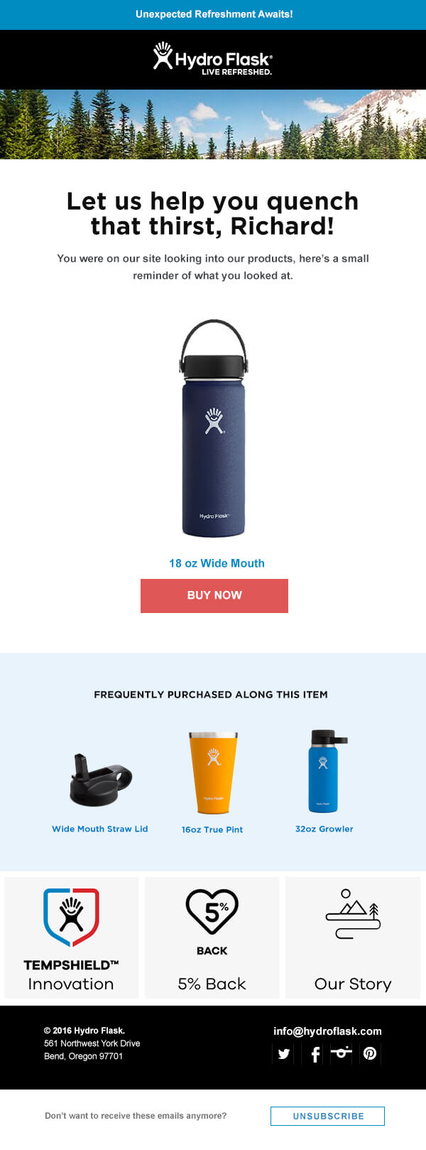
Lastly, we have Hydro Flask, a water bottle brand. Not only does this abandoned browse email contain the abandoned product, it also has the shopper’s name for an extra layer of personalization. Then, Hydro Flask goes another step further and shares some products that have been frequently purchased with the abandoned item.

These examples are all playful, light, no-pressure reminders that aim to bring the browser back to the site rather than scaring them away. These messages may look a lot different than abandoned cart emails and it’s because of where these customers are in their shopping journey.
Shopping Journey Stage Matters
We’re by no means knocking abandoned cart campaigns in favor of abandoned browse campaigns. It all depends on where customers are in their shopping journeys. There are times when it doesn’t make sense to send an abandoned browse, but it all relies on how the customer might receive said messages.
From the examples provided, it’s evident that abandoned browse messages have a softer, less urgent tone. Abandoned browse campaigns are basically suggesting that the user comes back to the site. Abandoned cart campaigns, however, are urgent and recognize that the shopper is right on the cusp of purchasing. If you push too hard with abandoned browse messages, you’ll scare shoppers away. But, if you take a more aggressive approach and highlight scarcity and deadlines with abandoned cart emails, customers with items in their cart may be more likely to convert.
Both abandoned cart emails and abandoned browse emails are great additions to any marketing strategy. In fact, it’s likely you’ll include both. The key is understanding when to send which and how to develop the right tone to appeal to your customers.
To learn more about the ways your marketing channels can be connected to guide shoppers through their buying journeys, request an Iterable demo today.
