There are several core principles of design that email marketers should keep in mind as they undertake any visual composition. A good email design is science practiced through art. Each line, each color, each typeface. Designs culminate in a collection of meticulous decisions for the greater impact of the whole.
That design impact can make or break the success of an email. An awe-inspiring design can drive click rates and embolden conversions. It even fosters brand loyalty.
And while the content of your messaging may be on point, a good email design can be the deciding factor for readers whether to read on or move on.
To help ensure your emails are read and your subscribers retained, we’ve scoured the internet—and the libraries of our friends at Really Good Emails and MailCharts—to see what design principles are in practice this year by the best email marketers.
5 Email Design Trends We’re Seeing in 2020
1. AMP for Email
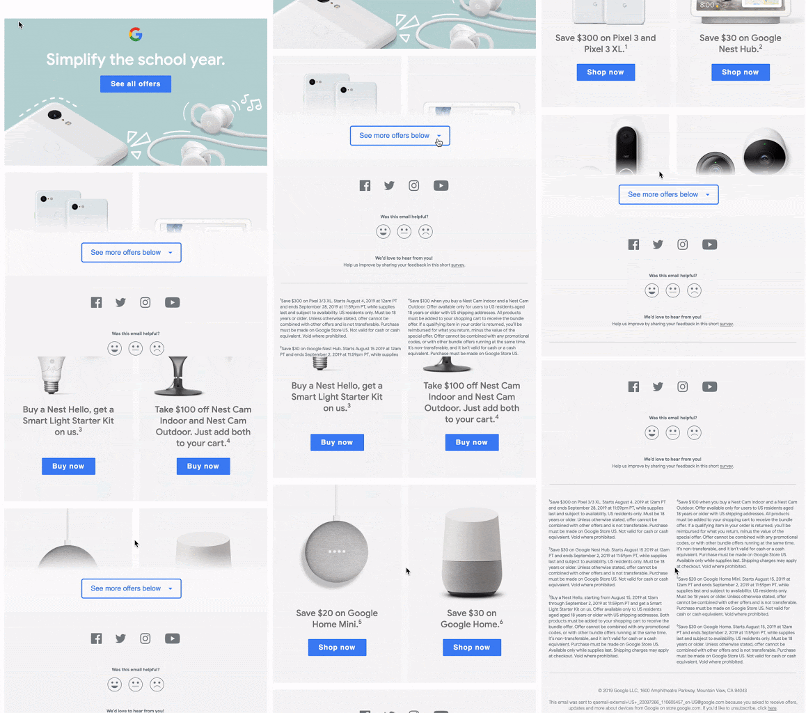
While technically a feature and not necessarily a design principle, AMP opens up the possibilities for interactivity in email design. For those unfamiliar, AMP allows marketers to personalize emails using up-to-date information and provide an interactive environment in which the user can take action.
Google uses AMP to emulate the website experience for browsing items. With this in place, email marketers can adopt website UX/UI design principles to create experiences more familiar to the average user. In a recognizable environment, the design gives the reader freedom to craft their own experience.
2. Leading Photography
A good design provides a natural direction for the viewer’s eyes to follow. Photography abides by a similar principle. Your eyes are drawn to a focal point before exploring to view the photo for all of its worth.
In 2020, we’ve seen brands embrace the potential of combining brand voice with visual presence. The result? Visually interesting photography that utilizes lines in a brilliant way to prompt the viewer to continue scrolling.
Furniture retailer Blu Dot uses header images showcasing eye-catching subjects that have a natural downward-facing progression to entice recipients to keep reading.
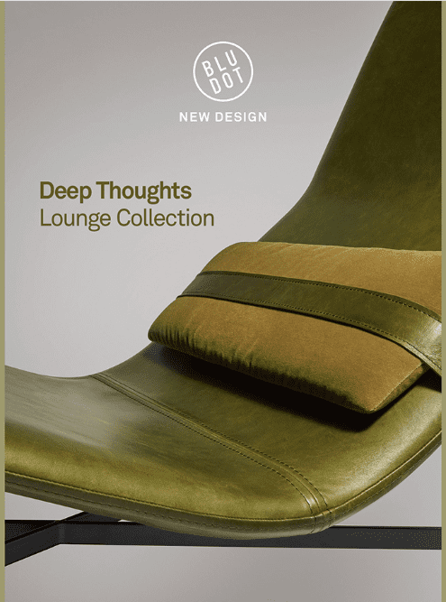

Blu Dot uses downward lines to encourage readers to scroll and see more. Source: ReallyGoodEmails.com
3. BIG TITLES
Bigger is better. An adage that probably makes many designers cringe. But, in the case of email titles, marketers are going bigger…and bolder. These unmissable blocks of text are concise and often informal, almost mimicking an urgent text message. They rope the recipient in with familiar or personalized language.
Nike gets straight to the point in its promotions.
4. Dark Mode
There’s a non-zero chance you’re reading this post at night, in a dark room, blasting your eyes with bright light before trying to sleep. Many apps have taken to dark mode to ease the digital strain on our eyes and emails are following suit with darker backgrounds.
Dark mode in email design isn’t always about ocular relief, however. A darker background can provide aesthetic contrast, emphasize certain elements or play into a theme, such as Halloween or Black Friday.
Snowman, a leading creative studio, uses a dark background when promoting Alto’s Odyssey to help establish a mood similar to that of the game.
5. Soft Palettes
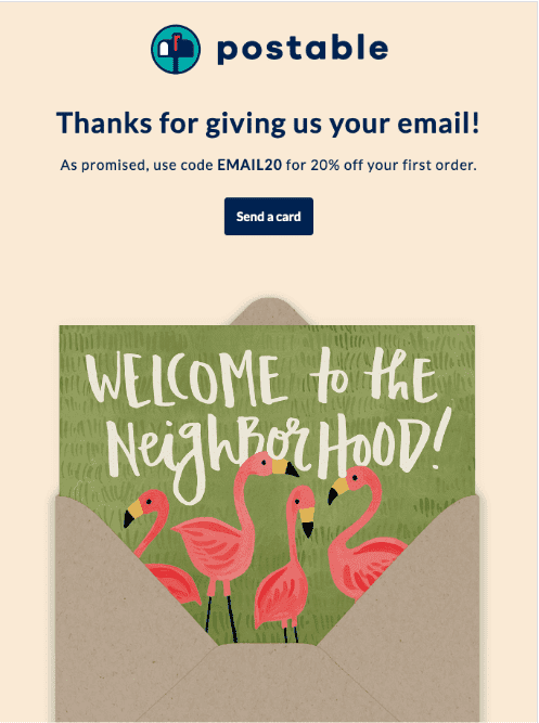
Working in stark contrast to #4 on our list, soft palettes are popping up everywhere. These generally muted colors provide a more playful tone than a stark white background and give images and bold text a chance to “pop,” as they say.
For brands with a more calming, informal tone, soft palettes are a good bet.
Direct mail card provider Postable chose a beige background to let their graphics and bold, blue type shine in a clean, loose setting.
The importance of good design cannot be underestimated or undervalued—just ask Apple about how design has impacted their success. Make a good first impression. Put your best foot forward. Whatever cliché you want to use, your email design is the first thing your audience will notice upon opening.
If you want your message to resonate, then you need a hook for readers. Reel them in by using these 5 popular email design trends in 2020.
Want to learn more about design principles and email marketing? Check out our webinar diving deeper into AMP and take a look at this post by our resident designer-in-chief to learn more about Iterable’s new brand!
