

At Iterable, we talk a lot about the digital space—emails, SMS, push, in-app, etc—and how marketers can communicate with their customers digitally to make a joyful experience. We’ve also ventured into the physical space talking about effective use cases for direct mail marketing, but there’s so much more to marketing than just these channels.
And there’s so much more we can learn from them.
With my background in content and journalism, I find myself fascinated with the ways stories are being told. I came across Variety’s recent cover focusing on the writers strike and it…well, struck me.
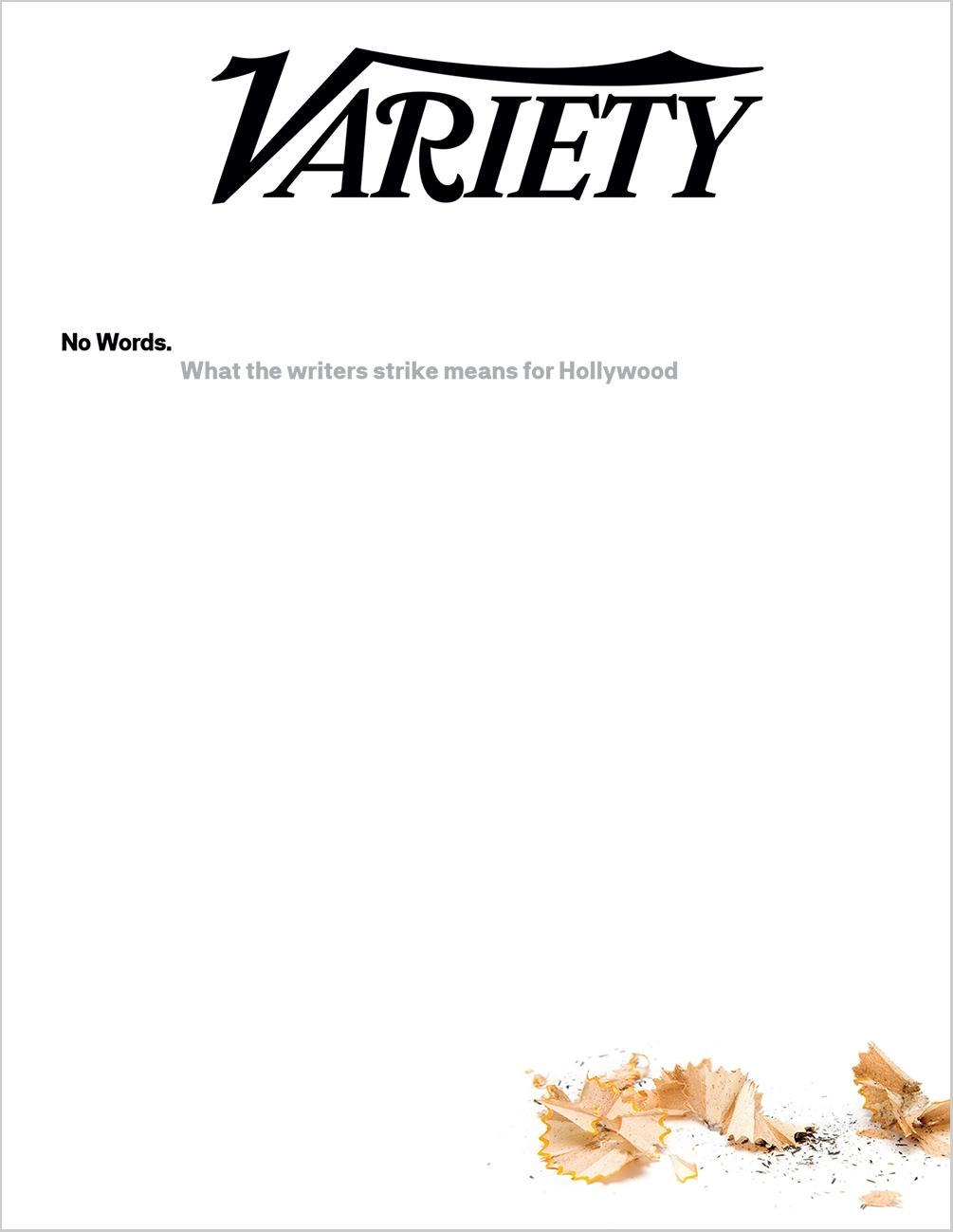
It would be difficult to have a more minimalistic cover to a magazine, and yet everything you need to know is right here. In nine words we know exactly what the top story of this magazine is. With a small image accent at the bottom we also get the sentiment and emotion of the story: hard work, grinding, and absence.
It got me thinking how a magazine cover is the entryway to a publication’s weekly/monthly/quarterly issue is similar to an email sent by email marketers, particularly promotions and newsletters.
So, with that in mind, let’s take a look at a few things magazine covers do so well that email marketers can keep in mind to tell a story in a small space.
Tips for Better Email Marketing From Magazine Covers
Know Your Audience
Variety is an entertainment news publication. They know perfectly well their core audience is (1) interested in the latest news in the entertainment industry and (2) already aware of the writers strike. There’s no need for them to say more than nine words to catch their audience’s attention.
When you know your audience for who they are and what they want, you can skip the pleasantries. While yes, Variety is a very established brand, it still speaks volumes to the trust they have in their audience to read between the lines—or lack thereof—to know what’s inside the proceeding pages.
The above is the most simplistic, straightforward approach, but it is not uncommon to see a busier cover be just as effective. It’s all dependent on the goal of your message. Sometimes your email will have a singular CTA, like Variety’s cover above, and that should be the main attention grabber.
On the other hand, you may have a lot to update your audience on so there is more of a need to use the empty space. Let’s look at another entertainment industry publication to see the other side of the spectrum: People.
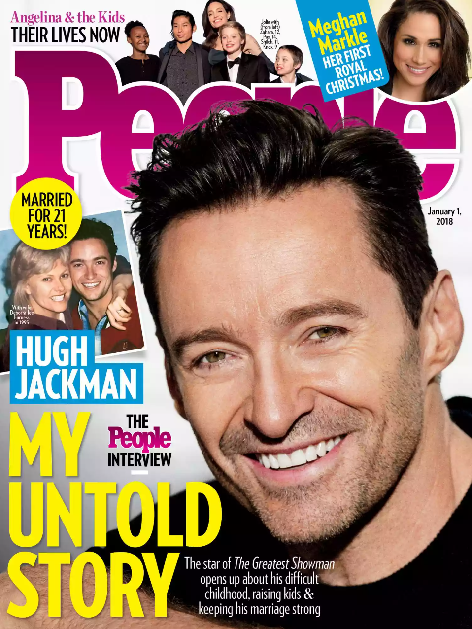
This cover highlighting Hugh Jackman follows a similar style People has employed for years: one main story with three feature stories, and significantly more than nine words. But that’s ok, because People knows their audience has varied interests and chooses their magazine for the options.
With email marketing, above arguably all else, brands need to understand who is on the other side of that send button. Are the recipients looking for options, or are they best served with a main story?
When determining how to fill the content of your email, focus on who your audience is, what they want, and why they come to your brand to get it.
Variety knows the answer to these three prompts: Entertainment industry fans, latest industry updates, detailed focused reporting. Nine words again.
Brand Consistency
Our inboxes are similar to a newsstand. Your message is not alone and only has a passing glance to grab attention. When I’m looking at a newsstand full of magazines—probably in the airport—I’m noticing two things: who has the most eye-catching cover and whose brand I recognize immediately.
Brand consistency is vital across all channels, but it’s particularly helpful in email marketing when looking to develop a loyal and engaged audience.
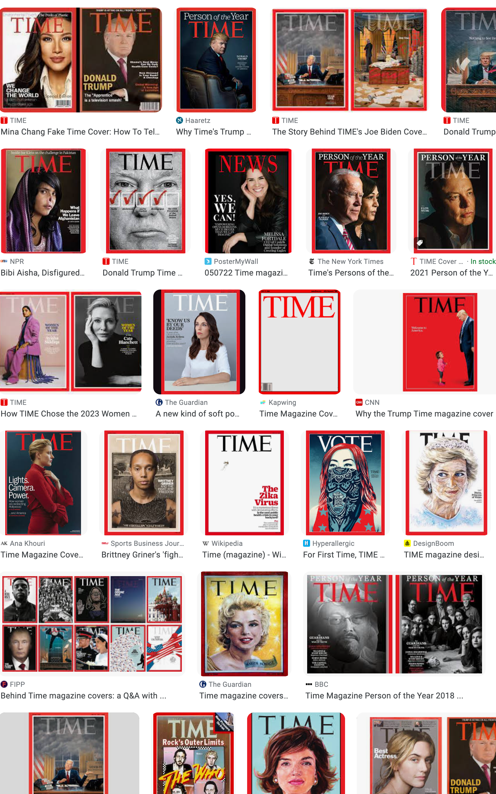
Look what comes up when Googling “Time magazine cover.” You know immediately it’s Time when you see that red outline and big, all-caps lettering. I could be sprinting past the newsstand about to miss my flight and still be able to identify that they have the latest issue of Time.
Same thing for Cosmopolitan. From the font to the poses to the busy cover like People above, you know immediately.
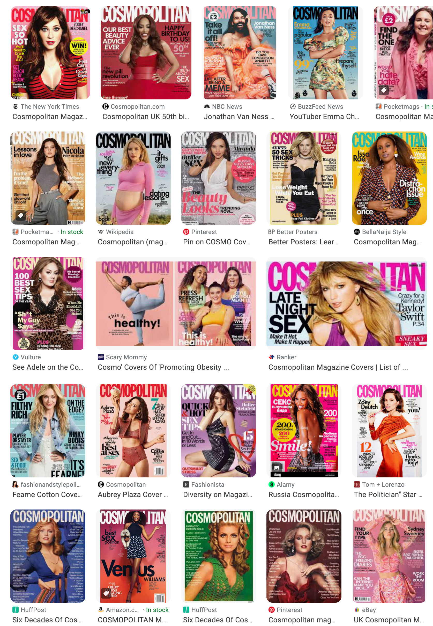
Your email and magazine still has to provide value in the content, but it’s unlikely your audience will even reach the content if they don’t first recognize the branding. If you back up good, consistent design with value, the brand recognition that comes from that first glance will ensure readers take a pause to see what you have to say.
Color and Contrast
The last piece of advice for email marketing that brands can take from magazine cover designers is something email has been doing for a while, but it’s worth a reminder: don’t forget to use color!
Time’s iconic red. Variety’s use of white. Wired’s use of contrasting colors. There are a host of examples in the magazine world that highlight the importance of using proper color complements and contrast to attract attention.
As you’d expect…or hope…fashion publications like Vogue often nail these concepts. This cover uses shades of red and blue while using shadow on the model to provide contrast.
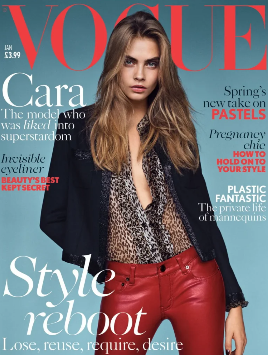
Whether your audience is flipping through the newsstand or quickly scrolling through emails, a striking set of colors will often be cause for pause. We’ve talked about color in our annual design trends posts (email design in 2023, 2022, 2021, and 2020) so refer back to those to see how your design efforts stack up to the recent trends across the industry.
Email and Magazines: It’s About the Story
I believe in the power of drawing inspiration from outside your industry’s bubble. While journalism and magazine covers aren’t a drastic departure from digital marketing, it’s still useful to analyze how the different use cases are still working towards a similar goal: grabbing and keeping the attention of an audience.
So, next time you’re in an airport, coffee shop, waiting room, or wherever else magazine covers live, take a more discerning look and think if there’s anything about it you might adopt into your digital marketing efforts.