Think back to web pages from the ‘90s and even early 2000s—woof. From flashing gifs to thick outlines and color combinations that gave you a headache, graphic design of yesteryear is best left in the past. Graphic design and email design trends, however, continue to evolve. One of the most notable transformations, which happened about ten years ago, is the switch from skeuomorphic to flat design.
While skeuomorphic design embraces three-dimensional shapes to mimic real-life objects, flat design is characterized by its simplistic two-dimensional design—perfect for responsive websites.
Flat design has translated to all marketing channels, including email. And, while flat design remains the overarching norm for email marketing, we wanted to explore some newer email design trends that have started to surface within flat design. Last year, we covered design trends that gained popularity in 2021. As we look at what 2022 has in store, keep in mind that these aren’t necessarily new trends, but trends we may have seen creep up in the past few years that we think will take off in the coming years.
1. Thinking Outside the [Header] Box
Static rectangles are so 2021. Back in the day, marketing emails were often stuck in rigid templates. A big header block at the top, content block that follows, and a footer block at the bottom. Now, however, email templates are becoming more fluid and flexible, giving designers the ability to extend beyond rigid right angles and explore more eye-catching shapes and layers. Rather than a straight edge, for example, an ovular or more organic shape can create an arrow-like effect, pointing to the content below.
“When using an email template to build from, you may feel limited in what you can design. You may think you’re locked into a rectangle header, but with the use of transparent backgrounds, you can create new shapes to accent your marketing message”
– Nick Jarrett, Iterable Senior Brand Designer
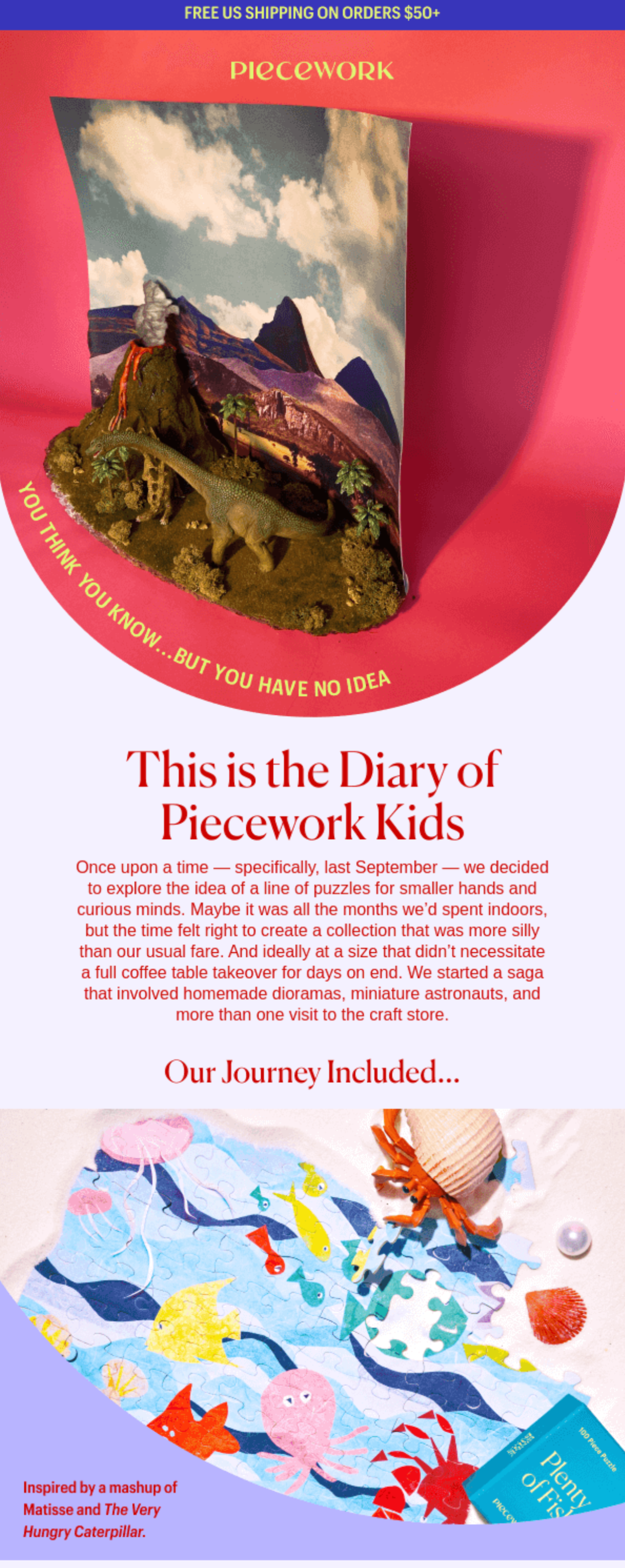
This example, from Piecework, a Puzzle company, shows a rounded header that guides the users’ eyes down the email. These days, everyone can do a rectangular template. But why be one of the many? Break out of the traditional template constraints and make the template work for your design—not the other way around.
2. Combining Photography and Illustration
Promotional emails and photography aren’t strangers. In 2022, however, expect to see more photography paired with illustrations to elevate the imagery. Illustrations can be used to help explain a complicated product, or add brand voice, tone, and personality to an otherwise generic image. “Being visually concise, illustrations provide immediate recognition, make complex things easier to understand, build trust, and are effortlessly memorable.”
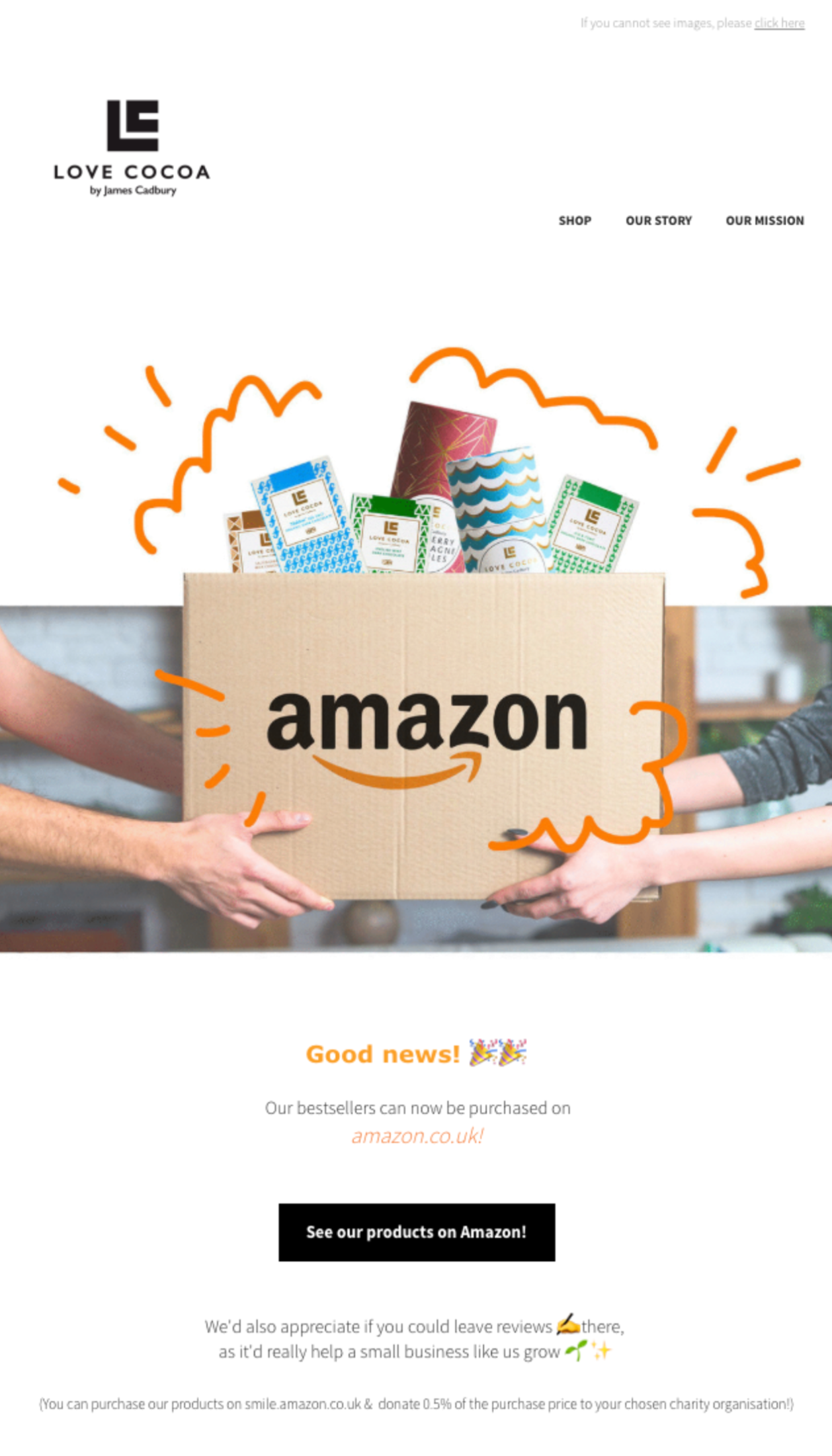
UK-based Love Cocoa, a chocolate brand, layered illustration over an image to create a level of customization that the image alone couldn’t deliver. The eye-catching small, illustrated lines bring the focus to the products, atop the box, and the Amazon logo. Even without the copy, it’s clear the purpose of the email is to announce that Love Cocoa’s products are being sold on Amazon.
3. The Re-Introduction of 3D
3D elements are a large part of skeuomorphic design. But, as of late, we’ve been seeing the re-addition of smaller 3D elements being added to email. We’re not expecting designers to revert back to full skeuomorphic concepts, but certain shapes within flat design are starting to adopt the long lost shadows and highlights of yore. Even in the above Piecework email, for example, the shadows create depth beyond a simple flat design.
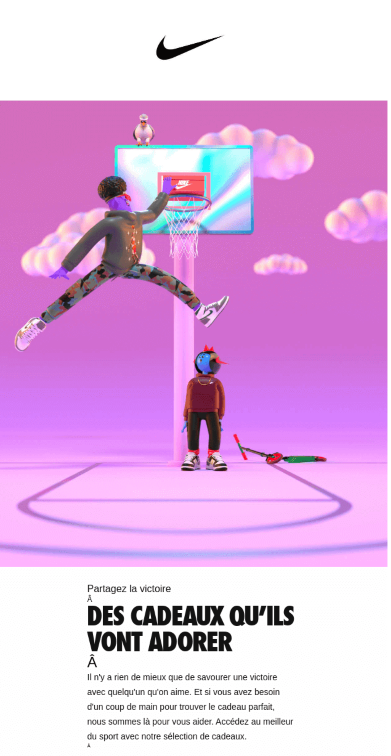
In this email from Nike, we’re seeing gradients, shadows, highlights, depth, and more. It does, however, still look different from OG skeuomorphic illustration. These elements really feel 3D—they have texture. In the past, 3D design has resulted in every element looking and feeling the same, but this new spin on three-dimensional design creates depth by adding a variety of textures and patterns to some—not all—of the components.
4. Overlapping Elements
Another email design trend we can expect to see more of in 2022 is overlapping email elements. Further blurring the transition between sections like non-rectangular headers, overlapping elements help break up the straight lines and edges and, as a result, can more seamlessly draw the users’ eyes into the next section of the email.
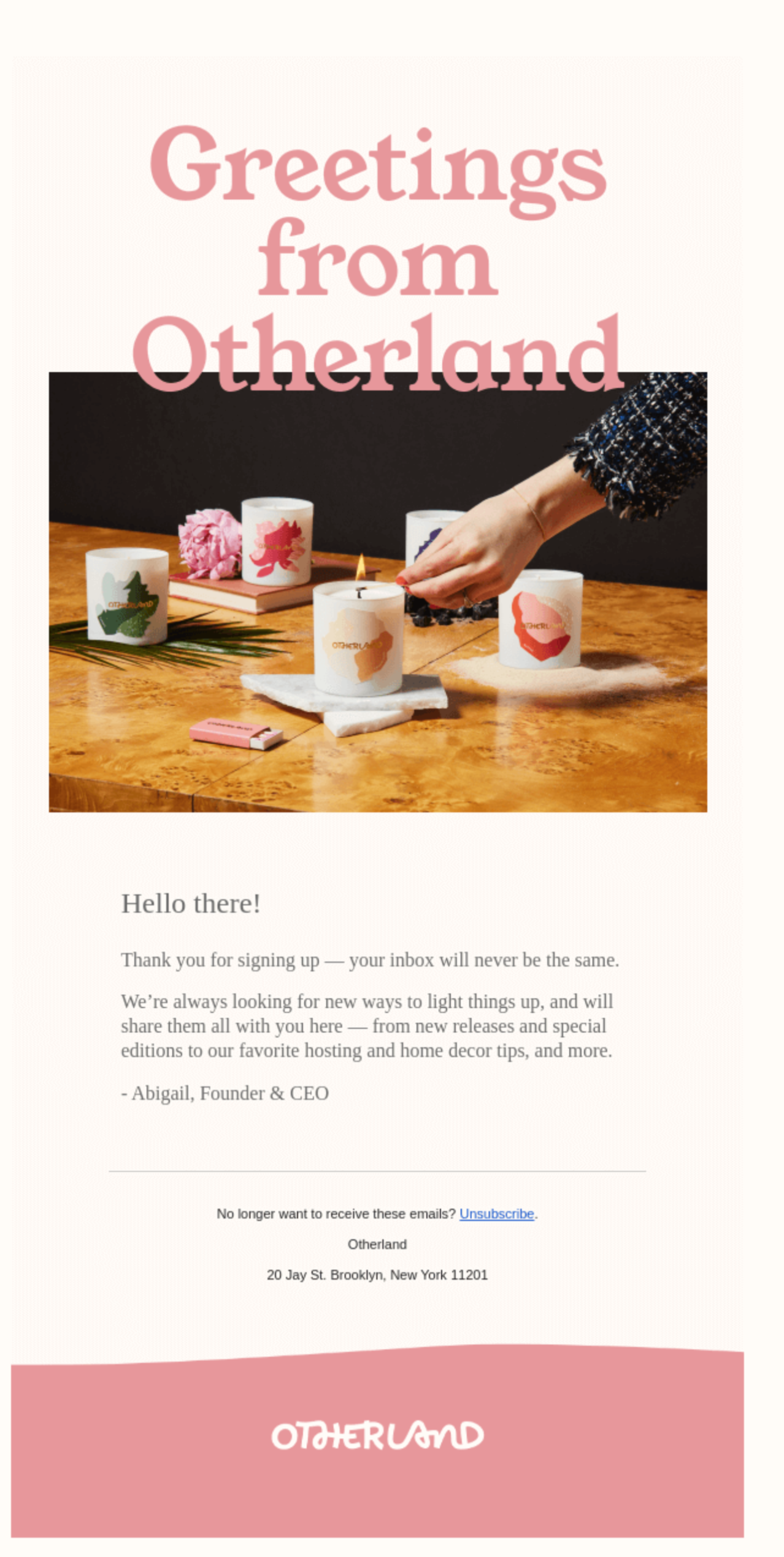
In this email, Otherland, a candle company, ever-so-slightly overlapped the header copy and the header image. Immediately the layering in this email differentiates it from others in the user’s inbox that either have just text, just an image, or an image centered over text as the header. This small overlap nudges readers to look at the image, and continue reading the email as their eyes have been led downward.
5. Bold, In-Your-Face Colors
While neutrals have been front-and-center recently in everything from fashion to interior design, bold, bright colors are making a comeback—especially in your inbox. Don’t believe us? Take a look at the Pantone Color of the Year for 2022. Spoiler alert: it’s an insanely bright periwinkle. Seems pretty intuitive—bright colors are attention-grabbing and marketers want to capture the attention of their audience.
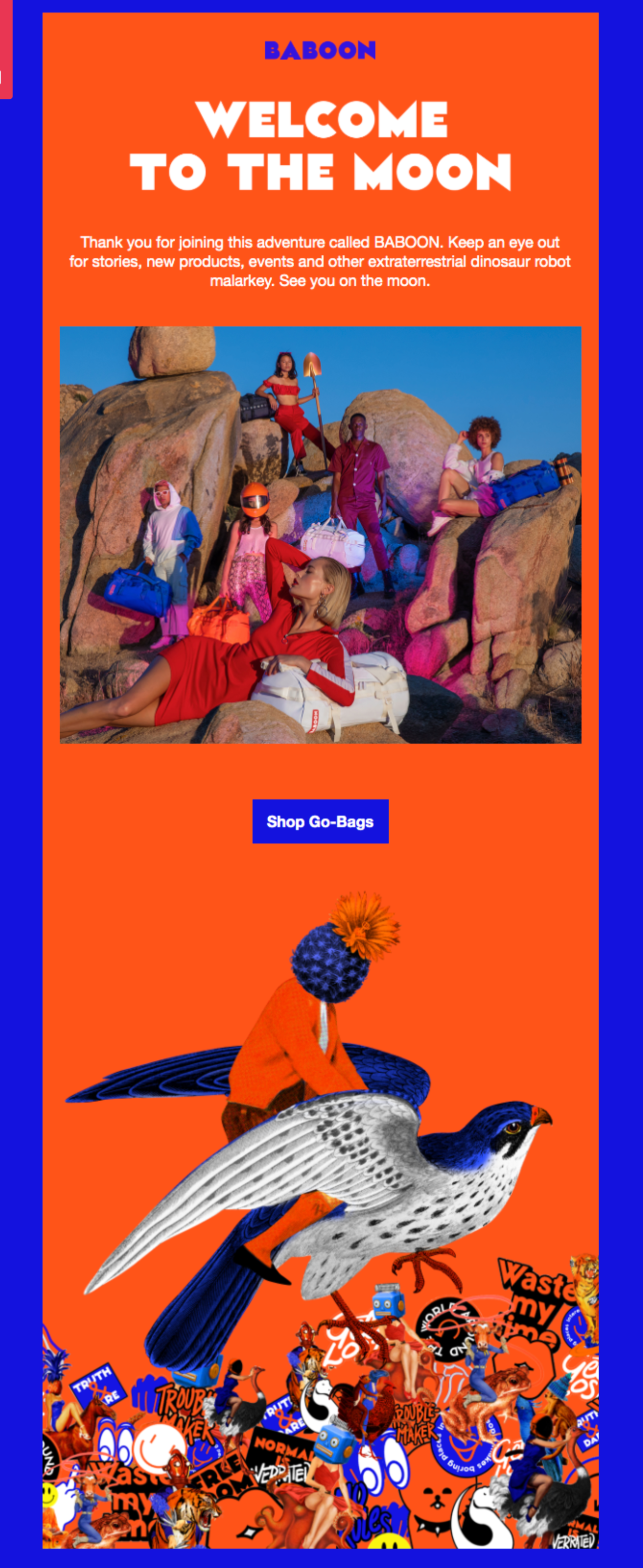
An exceptional example of the email design trend is the welcome email from bag brand, Baboon to the Moon. Not only are these colors wildly bright, but they’re complementary. They’re on opposite sides of the color wheel and, as a result, create high contrast. If a new customer is thumbing through their inbox, they’re not going to miss this.
Email Design Trends Shouldn’t Dictate Your Brand
Escaping boundaries, creating depth, combining styles, and using bold colors are going to be common themes popping up as we get farther into the year. But, these email design trends come with a caveat: remember that marketing teams should avoid adopting trends that don’t align with their brand. If Baboon to the Moon normally used neutrals and soft pinks, then sent a welcome email with electric blue and neon orange, it’s going to confuse customers and dilute brand trust. Trends are helpful to guide your marketing strategy and design, but don’t lose your identity in the process.
What matters most is the customer experience. So, if changing up your email design to stay on-trend confuses and frustrates your customers, it’s not doing you any good. Think about how adopting these trends can elevate your brand to enhance the customer experience, and if they do, be sure to have fun with it!
To learn more about how email marketing can impact the customer experience, schedule an Iterable demo.