Despite the ongoing effects of the pandemic, what gives us hope is how brands remain undeterred in their mission to improve their customer experiences.
This year, B2C marketers plan to increase their marketing budget by more than 25% to continue investing in innovative technologies, such as modern marketing automation platforms that harness the power of email marketing to influence consumer spending.
But they must use their allocated resources wisely. Fortunately, you don’t necessarily need a huge budget to create head-turning campaigns. With some design inspiration (and A/B testing), you can boost engagement and drive customer loyalty during these unpredictable times.
Thanks to the following examples from Really Good Emails, you’ll find a curated list of eight email design trends to get your creative juices flowing.
(And for those keeping track at home, yes, while these emails may not have been created this year, we believe that these are the design trends that are sure to persist in 2021.)
Let’s dive right in!
8 Email Design Trends to Inspire You in 2021
1. Clean, Simple Design
The Nue Co. believes in providing customers with clean, preservatives-free products, and this philosophy is reflected in this campaign.
The judicious use of white space, crisp lines and neutral colors exude sophistication without distracting the reader from the core message.


Source: Really Good Emails
Calm, a mindfulness and meditation app, uses alternating visuals and text and soothing colors to create a relaxing effect for its sleep-challenged reader.
The images help the reader visualize a good night’s rest while the instructor’s bio lends credibility to the course and encourages the reader to sign up.


Source: Really Good Emails
2. A Pop of Color
Airbnb’s brand personality is typically more subdued, but this thank you campaign proves that a splash of color can liven up a message without losing brand identity.
The attention-grabbing rainbow award card inspires joy, happiness and gratitude without overstimulating the reader.


Source: Really Good Emails
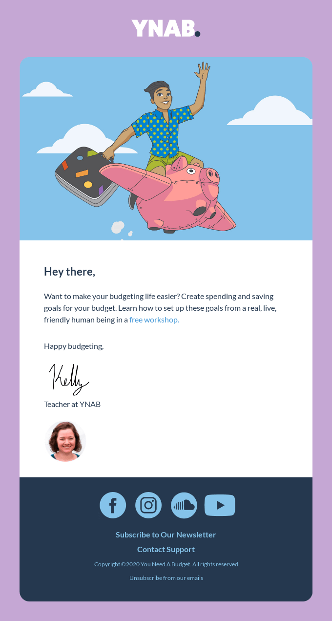
You Need A Budget (YNAB) is personal budgeting software that makes financial planning less intimidating and more fun with its use of color.
While the soft purple background makes the message stand out, the blue sky arouses a sense of peace and security, both of which can be achieved through careful money management.

Source: Really Good Emails
3. Bold Typography
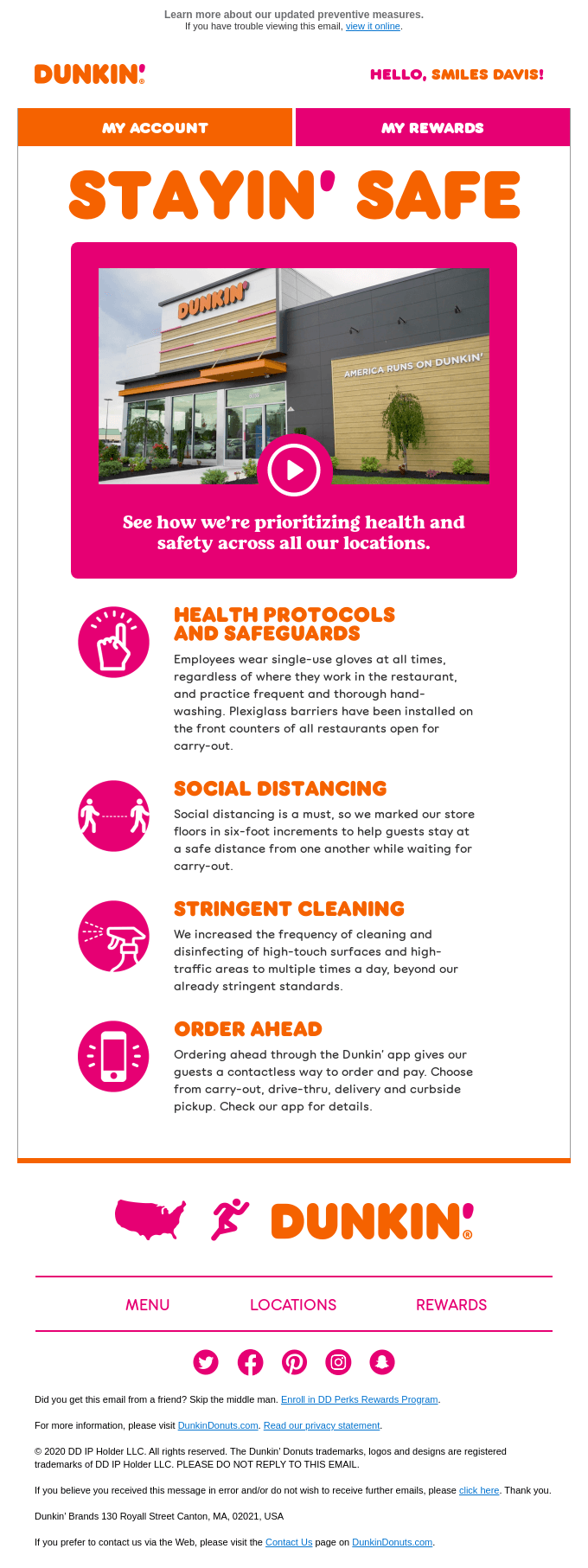
Dunkin’ uses a bright, sans-serif headline in this coronavirus-related email to maintain its brand identity and provide maximum readability for the reader.
The message about health protocols and safeguards ensures people’s safety, which helps earn the reader’s trust.

Source: Really Good Emails
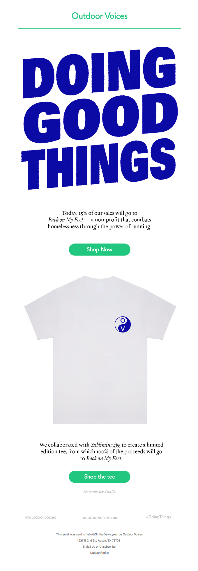
Outdoor Voices uses its, well, outdoor voice to get people to shop for a charitable cause.
The big, blue headline provides excellent readability across multiple devices and also evokes feelings of selflessness in the reader.

Source: Really Good Emails
4. Playful Shapes
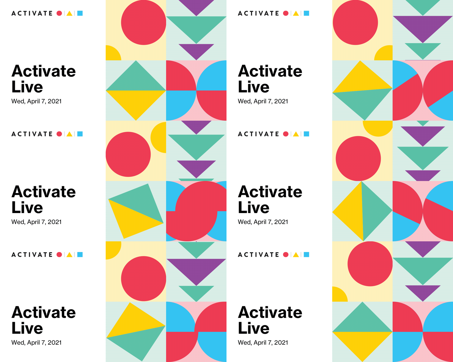
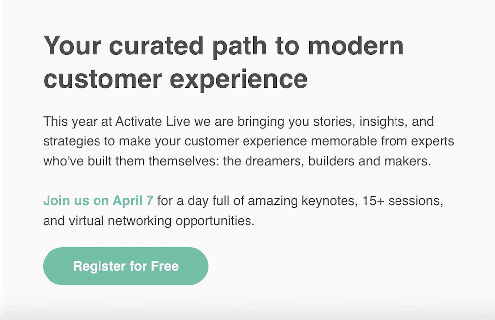
Delightful messages come in all shapes and sizes, and Iterable’s Activate Live announcement campaign is one of them.
The animated, colorful shapes are strategically placed to highlight the message, and the reader can’t help but take action to learn more about the upcoming virtual event (or at least we hope so!).
Save your seat for this can’t-miss event.
Blu Dot, a contemporary furniture shop, understands that ottomans aren’t just for storing extra blankets.
To highlight their versatility, they arrange them in fun, playful ways with the help of models to inspire the reader to purchase this multifunctional item for their home.


Source: Really Good Emails
5. S-Curve Layout
Feather, a provider of furniture rentals, strays from the standard one-column layout to create a modular or “S-curve” design.
Its use of negative space helps distinguish the modules and the featured items, and the descriptions invite the reader to mull over the details before deciding which pieces they want to rent.


Source: Really Good Emails
U.K. home improvement and DIY retailer, B&Q, delivers an email campaign with a sleek, modular look that’s hard to ignore. Each block literally paints a picture of how the featured shades, ranging from white to bright turquoise, can transform someone’s walls.
Overall, the layout, minimal use of bright color, and clear CTAs make this message compelling for the reader.


Source: Really Good Emails
6. Action-Based Animations
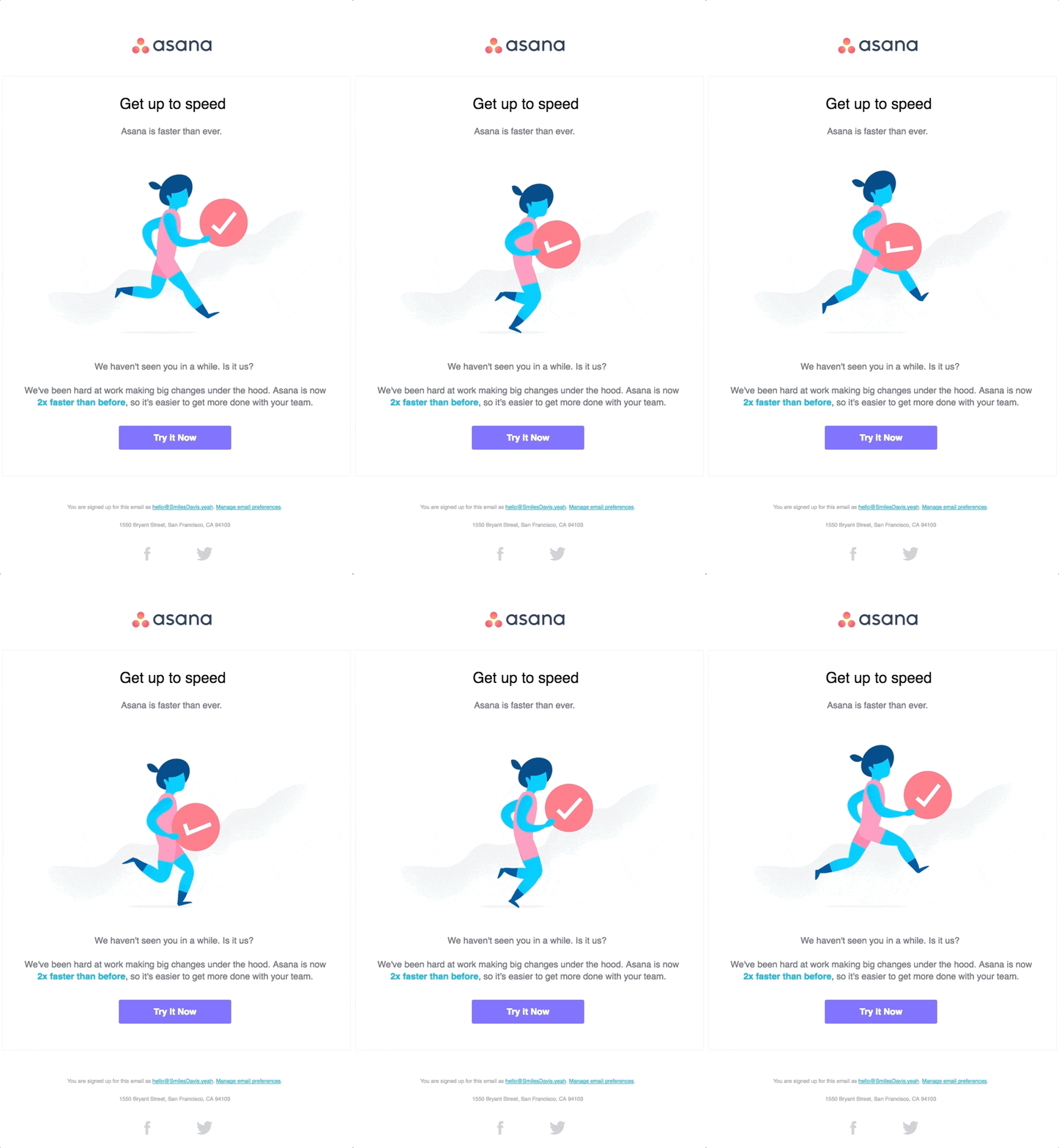
In this re-engagement campaign, project management app Asana uses an animated running figure to convey speed and agility, both of which are essential to completing a project on time.
Aside from bringing life to this message, this animation also creates a sense of urgency for the reader and prompts them to take immediate action.

Source: Really Good Emails
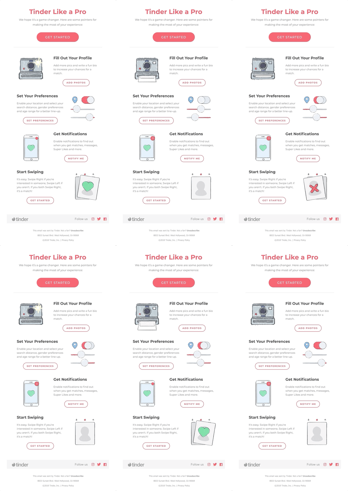
Online dating app Tinder uses animations in this onboarding campaign to educate a new member about its services, and each animation represents a different action.
Whether it’s inviting the reader to upload a picture, set preferences or enable notifications, the message is clear: The sooner they complete their profile, the sooner they can starting swiping and connecting.

Source: Really Good Emails
7. Value-Illuminating Illustrations
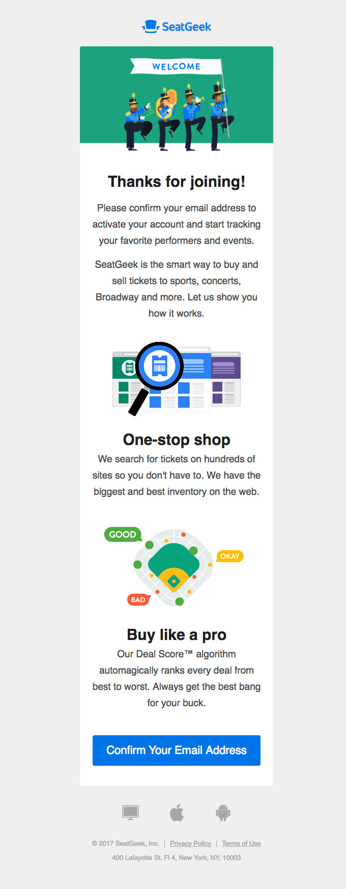
SeatGeek often uses illustrations to add an element of storytelling to its messages.
In the example below, the marching band, magnifying glass and stadium highlight the main benefits of using its ticketing service, which include getting the best deals on live music and events from one source.

Source: Really Good Emails
Aspiration, a socially-conscious digital banking alternative to traditional financial institutions, makes this campaign warm and inviting by including a benefits-driven message and a relevant illustration to match. The mountain background on the credit card illustration depicts “your chance to reach the pinnacle of bank accounts.”
While the image adds a touch of lightheartedness, the message instills a sense of purpose for the reader, enticing them to sign up and “do good at the same time.”


Source: Really Good Emails
8. Back in Black
Whether you’re a designer creating beautiful prototypes or an engineer building a chatbot via an API, Marvel (not associated with Marvel comics) has you covered.
Thanks to stay-at-home orders during the pandemic, the average screen time has increased dramatically, and dark-designed emails can provide some much-needed relief while engaging the reader.


Source: Really Good Emails
Harry’s knows how to highlight its product in razor-sharp focus. Its dark design creates a sophisticated look that appeals to its target audience.
It’s important to note that users don’t need to have dark mode enabled to recognize the benefits of a dark color palette. Not only can it help reduce eye strain, but it can also offer unique depth and dimensionality that stands out in the inbox.


Source: Really Good Emails
Closing Thoughts
As you go about this year, think about how you might incorporate some of these email design trends into your campaigns. What speaks to your business—is it minimalism? Bold typography? Bright, colorful shapes? Whatever you choose, make sure it not only aligns with your brand personality, but also delivers value to every customer.
Want to give your email marketing a makeover? Reach out and schedule a demo with Iterable today.
