A few weeks back we launched the first release of Aurora, featuring a new design for our suite of creative marketing automation and analytics tools. Aurora isn’t just a fresh coat of paint; it’s the next generation of user experience, introducing a modern visual design language and investment in usability throughout the whole platform. By bringing together best in class user experience and design with a world class data platform, marketers can build amazing customer experiences like never before.
This was a rewarding, months-long endeavor that involved the development of a brand new design system, redefining the way we think about our UI. We want to share some insights from our journey!
Where Did It All Begin?
Our early engineers built Iterable’s UI using off the shelf component libraries. This sped up early implementation velocity, and allowed the team to deliver core product capabilities quickly. It gave the team room to focus effort and capital on developing a best in class flexible data architecture and delivery platform that has scaled to meet the demands of billions of messages delivered each year.
But Iterable as a business has matured in the years since its founding, growing to hundreds of customers and billions of customers’ customers. We have a clear vision of authenticity, connection, and joy, and the user experience and visual design language needed to mature to meet it. But, how could we get there? And how could we systematize that to make it repeatable, integrating it into our work and team culture?
The Evolution
1. Defining Guiding Design Principles
Design principles are shared guidelines that capture the essence of what good design means for the team, and advice on how to achieve it; in other words, agreed criteria for what constitutes good design in your organization and in your project.
― Alla Kholmatova. Design Systems
We started by defining a set of design principles to inform our thinking and work, with the goal of democratizing creative direction and guiding our team in everyday decision making.
Effective design principles answer the question “what does good design mean at your company?” The north star for any product should be guided by the emotional response the product evokes from its users, and the jobs that it aims to serve.
Here at Iterable, creativity and performant outcomes are the keys to our customers’ success. With that perspective, we got to work, and had each of our designers independently answer the question “What does good design mean at Iterable?”
Here are a few of examples of the many answers our team provided:
Iterable should…
- “inspire creativity/promote discovery—marketing should be fun, provide tools that encourage users to discover new ways to connect with their users”
- “enable practitioners to spend more attention on the things they care about (creativity + compassion), and should get the boring, routine stuff out of the way.”
- “be a safe and predictable workspace so marketers know they aren’t going to do something nuclear by pressing the wrong button”
- “be approachable to marketers of all skill levels, not just for marketing masters and power users”
After some clustering, discussion, and workshopping, the team landed on four principles: Approachable, Empowering, Clear, and Expressive.
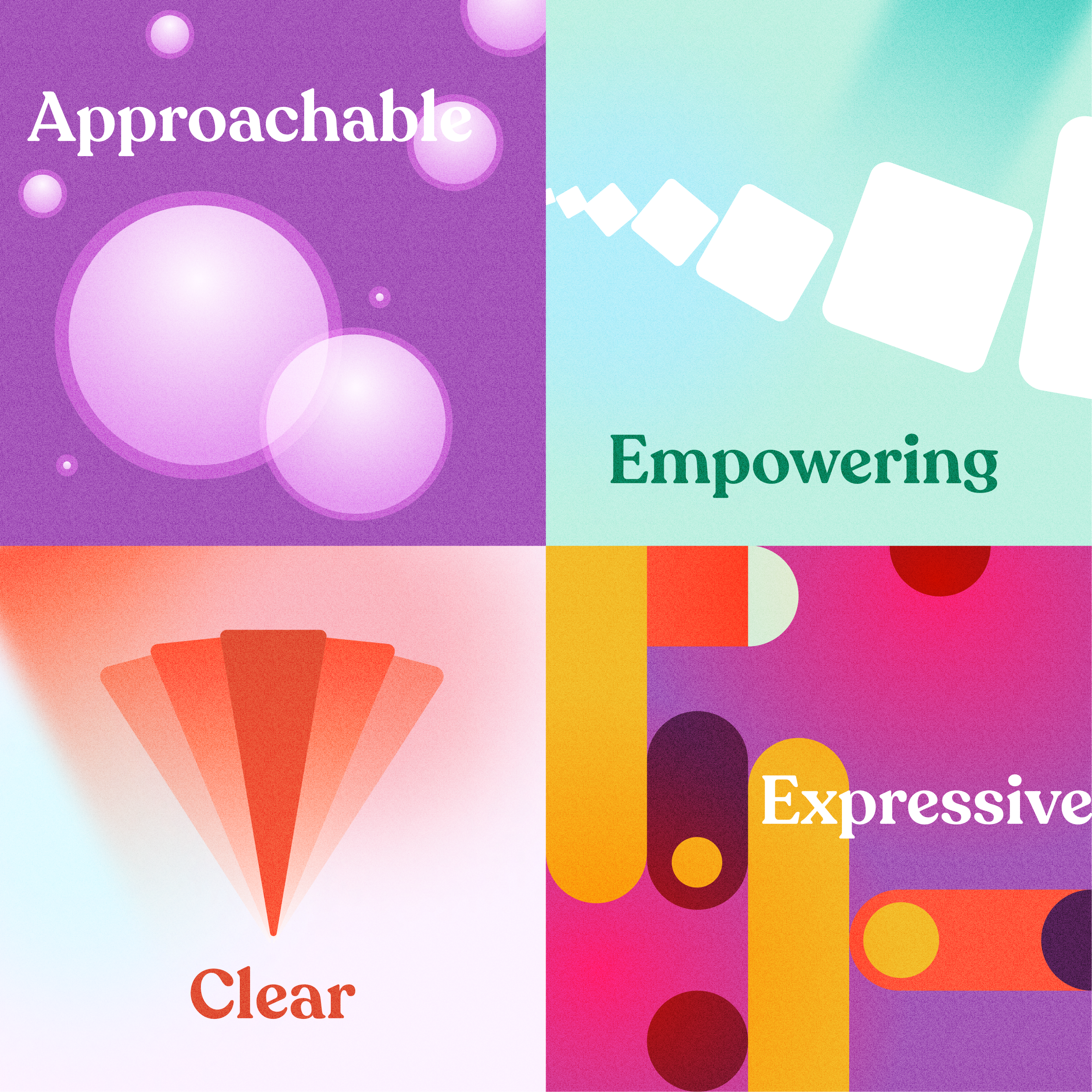
Approachable: We invite experimentation, letting our customers creatively wield Iterable without fear of messing things up. We believe consistency begets familiarity, predictability, and comfort, and put guardrails in place to mitigate risk.
Empowering: Iterable provides a path for every customer to become a marketing expert. We get the heavy lifting out of the way and foster learning throughout the application to provide our customers with the tools and guidance to level up when they’re ready.
Clear: We have a point of view on what matters most in which context, and only require our customers’ attention when it is truly warranted. Progressive disclosure minimizes distraction, while clear hierarchy and copy reduce ambiguity to minimize second guessing.
Expressive: Our voice, tone, and UI reinforce our brand’s personality traits: brilliant, focused, playful, humble, and upbeat. We’re mindful to map the tone to how our customers are feeling on their journey, creating moments that celebrate and reinforce successes, meeting errors with the seriousness they deserve, and getting out of the way when efficiency is the key.
We still have more to do to make them actionable, but they provide pragmatic, directional guidance, and work toward a shared aspirational standard of what it is that we’re striving for.
2. Exploring Concepts
With some branding building blocks (brand colors, typeface, personality traits) and our design principles at hand, we started to work through conceptual explorations of what the future of Iterable could look like.
There are over 100 distinct pages in our product, and thousands of interactions. To create our first design concept, we needed to land on a place to start, something that would be representative of overall functionality but also limited enough in surface area to drive agility and velocity of exploration. We turned to usage data to guide us, identifying our most trafficked pages, and then removed those where there was a lot of overlap in UI (similar table layouts, for example.) That way we could get the most mileage out of each of our concepts, increasing the odds of design decisions cascading to cover more ground throughout the app.
We took each of those selected screens and ran with them. We imagined what a more collaborative template overview page could look like with an expressive visual design language that was more playful and bold. We imagined what a clearer workflow canvas could look like, where the surrounding chrome got out of the way when you needed it, emphasizing what matters most. We explored concepts for other pages too, like segmentation, the template editor, and campaign creation.
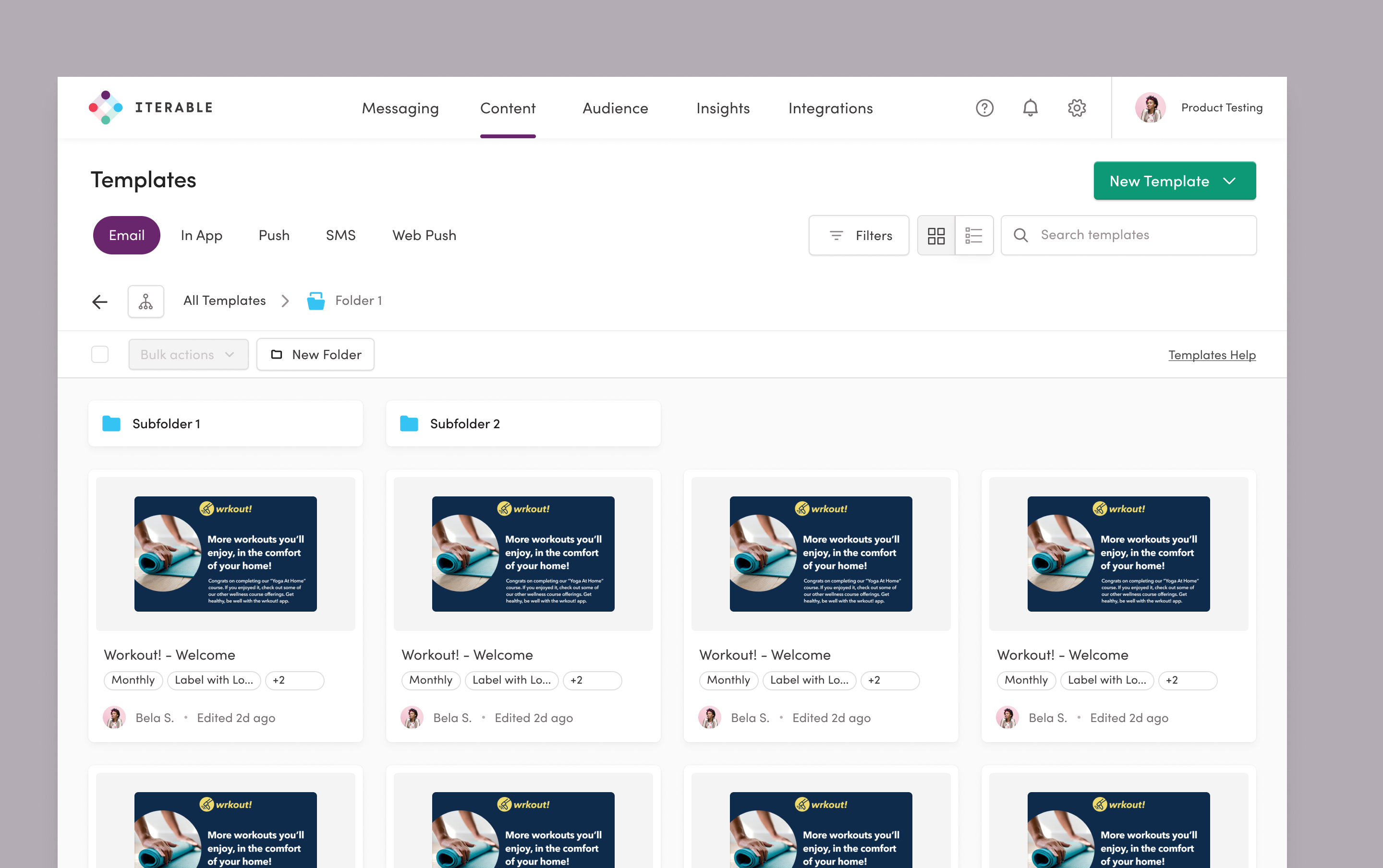
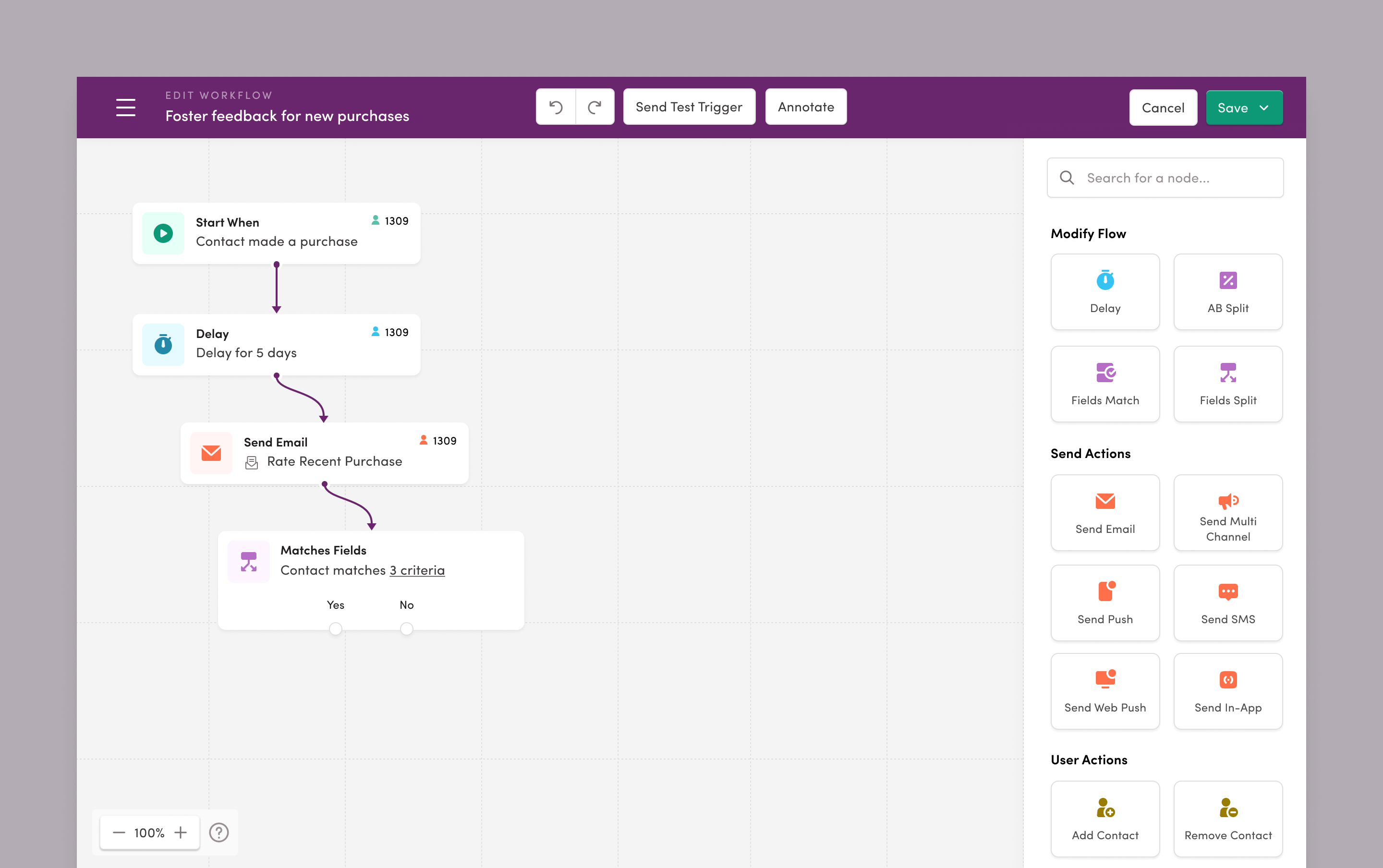
Each page went through a series of rapid iterations, balancing visual design exploration with opportunistic UX enhancements. We shared sneak peeks with customers and internal stakeholders along the way for calibration and validation, and in a short time landed somewhere that felt right, and authentic to Iterable.
3. Abstracting Patterns and Components
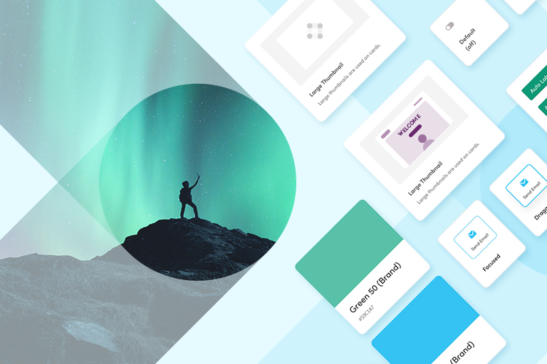
Having a set of conceptual prototypes that covered a significant surface area, we wanted to abstract everything that was repurposable into our new design system. This would serve as a reference for the design team (and product, and engineering). It’s a set of tokens, components, and guidelines to draw from for all new designs, so that our output would have a consistent behavior, look, and feel regardless of which team was working on it.
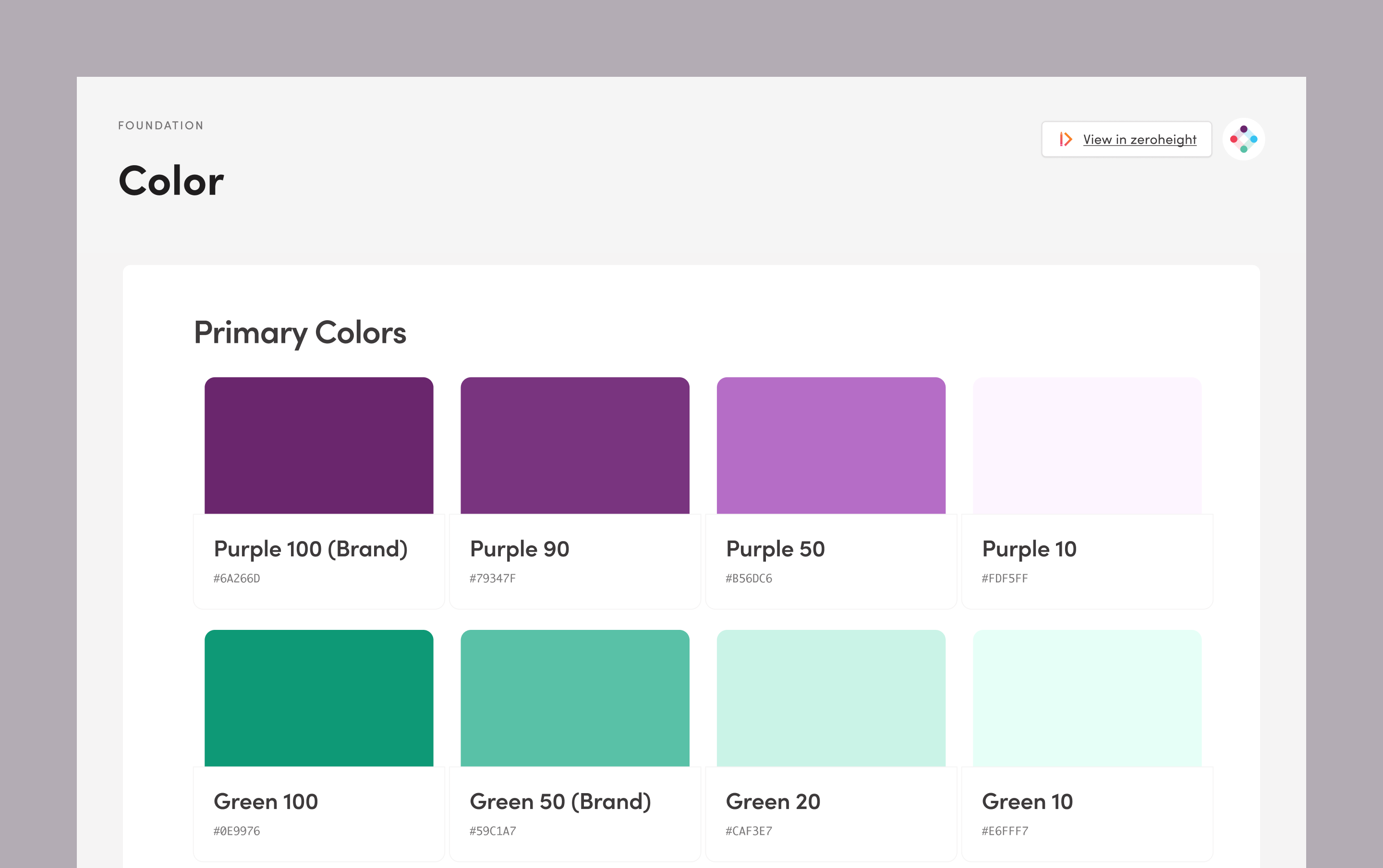
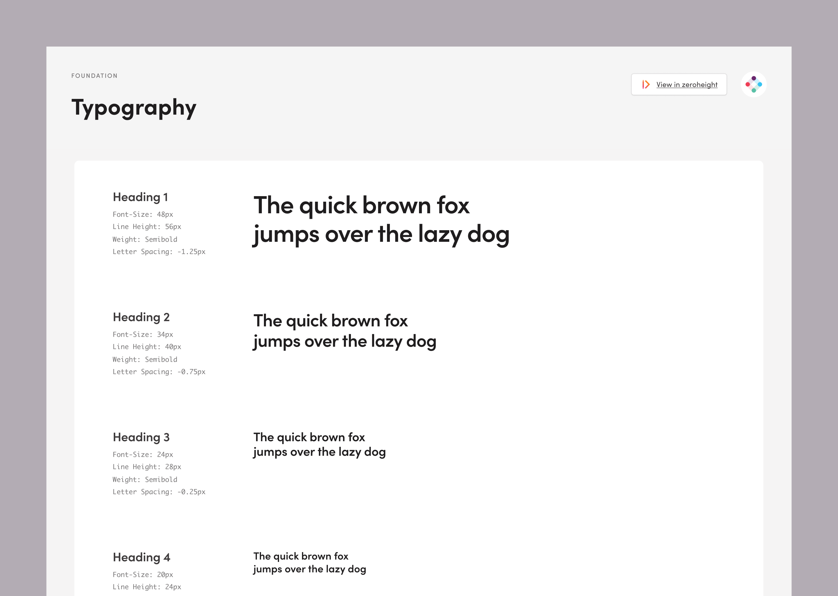
First up were the primitives, or foundational styles, like colors, font styles, and spacing units. These drew directly from our brand guidelines, and were modified to consider a product context for things like color accessibility and typographic needs.
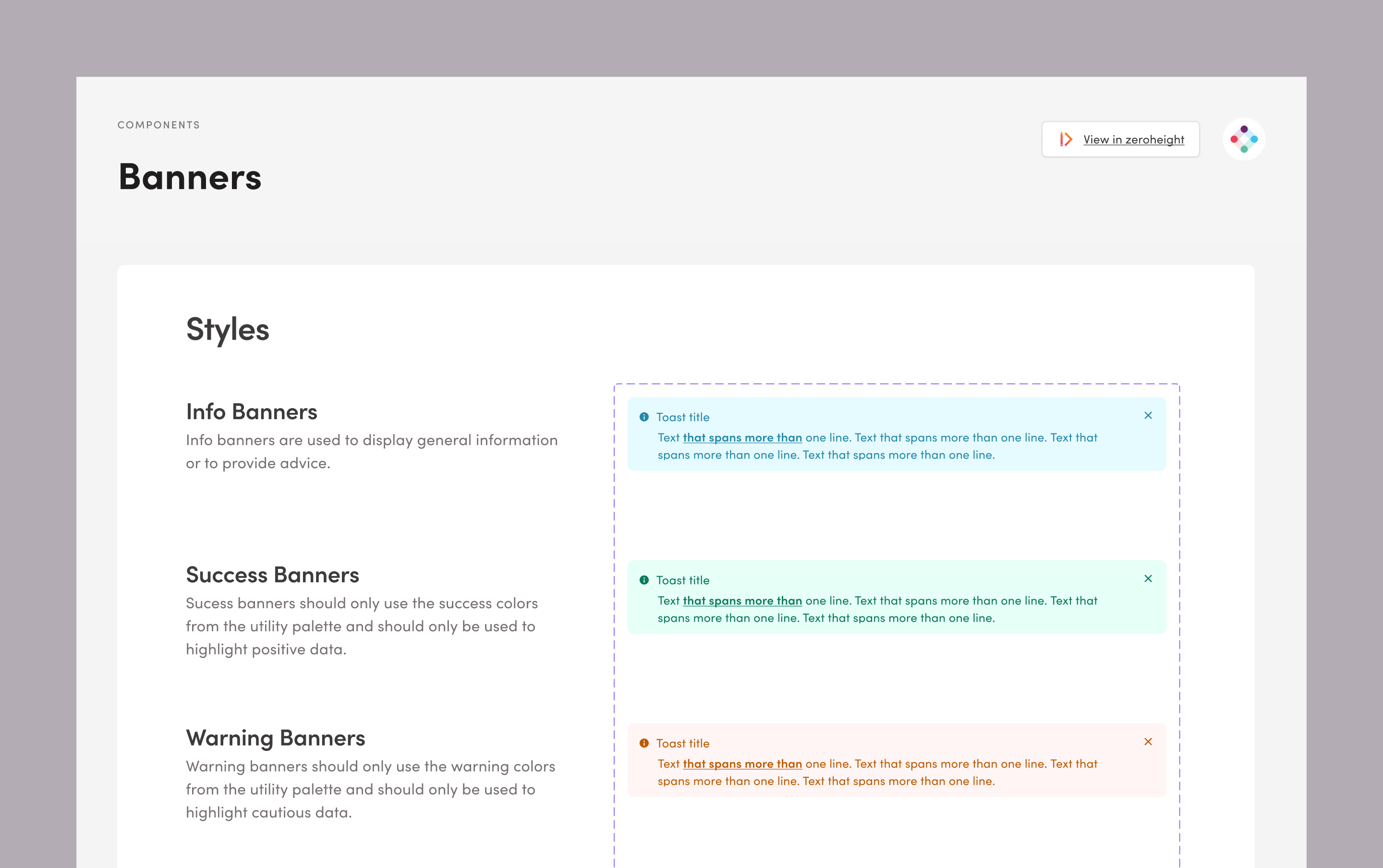
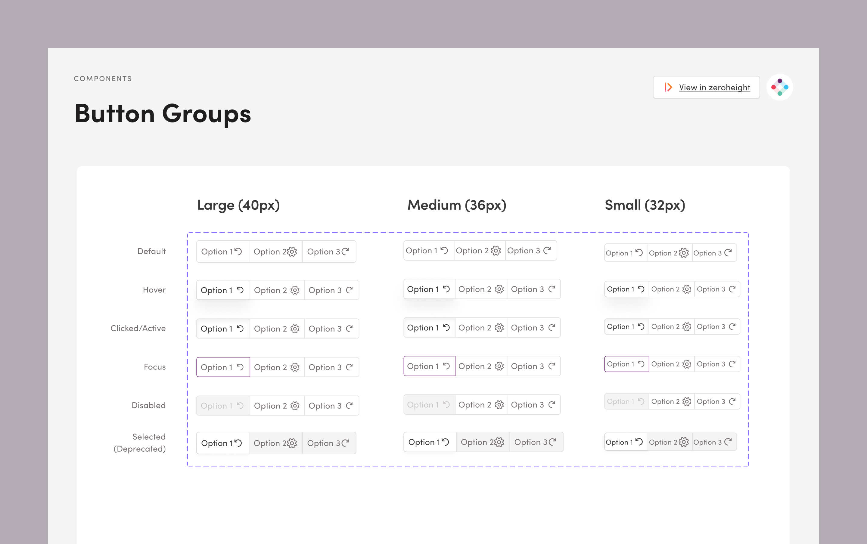
Reusable components were abstracted too, like buttons, inputs, and dropdowns. Engineering jumped in here to build out the initial set, to increase velocity for future development.
We made sure to define usage guidelines along the way, considering content rules, best practices, and notes on accessibility. Designers lean on these to know how and when to use each of our components, leading to a more cohesive experience across the platform.
Putting that all together, we have a comprehensive design system that is unique to Iterable and our customers’ needs, and perspective. It’s a living system, something we’ll continuously build upon, helping us elevate our design quality, accelerate design velocity, and reduce design debt. Most importantly, it will help us build a product that is beautiful and easy to use, empowering our customers to be better at their jobs.
4. Putting It Into Practice With Customer Feedback
With our design principles, concept designs, and a design system supporting us, we were ready to put it all into practice, revisiting some concepts with more rigor to actually build them out and deliver to our customers.
Teams reviewed baseline usability testing for each of the respective product areas we’d settled on, and interviewed customers and internal subject matter experts on problem spots and opportunities. Designers across teams leveraged our pre-built components, created high fidelity mockups and flows, and built out prototypes using the new system.
There were of course gaps there, questions that needed to be resolved as patterns and components started to show up in new and sometimes unexpected ways. But we had a shared language for talking through those cases, and were able to evolve the design system where it made sense to.
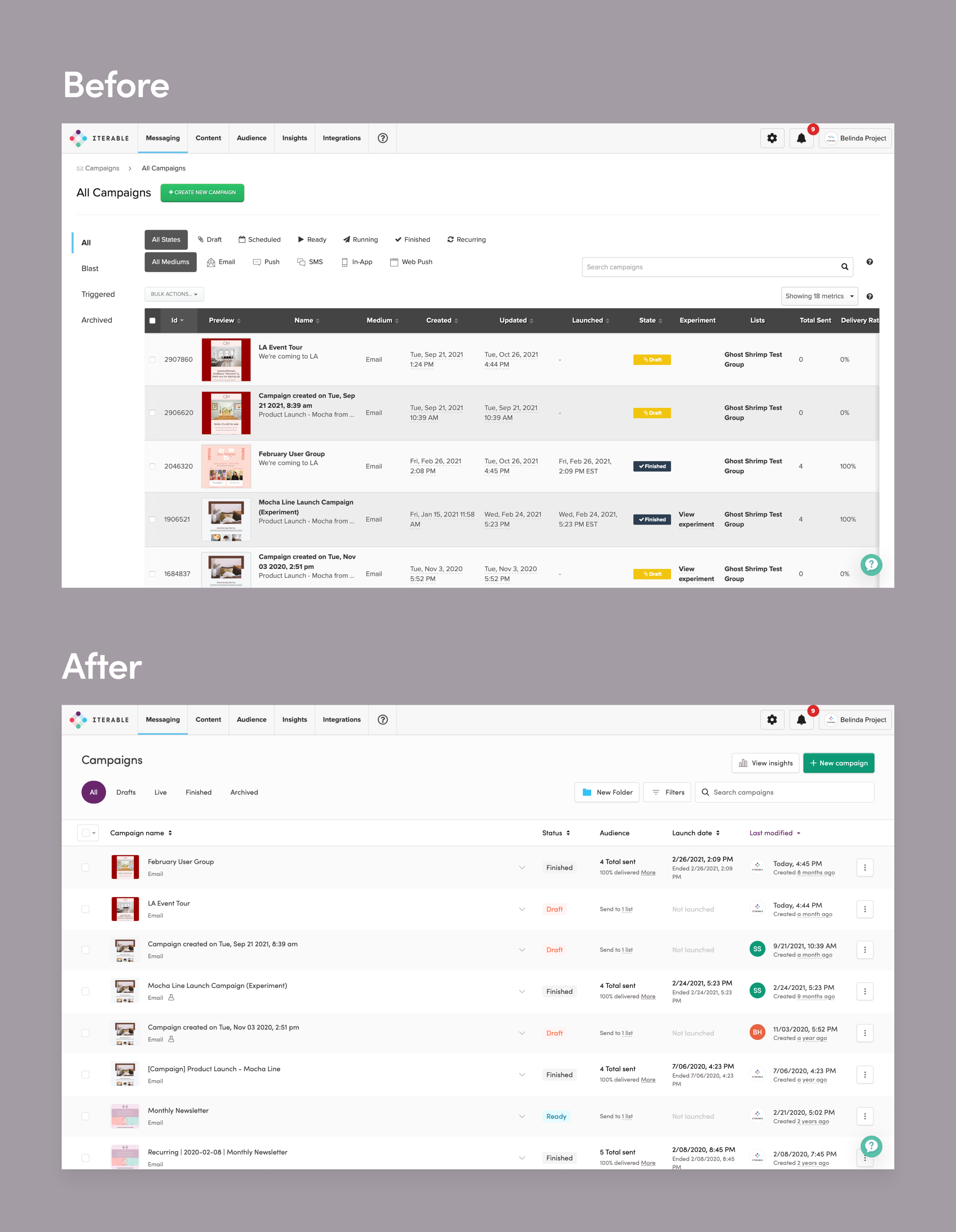
We got additional reactions to the look and feel when we walked customers through our prototypes, and were able to stress-test the system in real-world scenarios like building campaigns and analyzing performance. Design velocity improved. There’s a greater sense of ownership, a shared vision of what we’re building toward, and the UI is a breath of fresh air. It’s a success all around.
Aurora Now and in the Future
Our first Aurora release was a big step in bringing our new design system to life. But this is just the beginning, and we’re excited to bring our new design language to every part of Iterable in the future. As we roll it out to new pages, we’re looking for opportunities to improve usability and add features that make it even easier for you to build great experiences for your users. We’ve already begun beta testing our new Workflow Studio, and started design work on several other pages. We can’t wait for you to see what’s next!
Schedule an Iterable demo today.